CandelaCharts - ICT Daily Profiles Go (DPG)📝 Overview
The ICT Daily Profiles by CandelaCharts, inspired by ICT teachings, offer a pattern-driven approach to trading by identifying and analyzing the key highs and lows of intraday sessions.
This toolkit automatically highlights these ICT Daily Profiles on your charts, allowing traders to efficiently identify critical zones for analysis and informed decision-making.
Whether you're an experienced trader or just starting out, ICT Daily Profiles deliver actionable frameworks to deepen your understanding of price behavior and enhance your intraday trading performance.
📦 Features
The ICT Daily Profiles toolkit provides a robust suite of features tailored to improve trading accuracy and support informed decision-making. Its key highlights include:
Daily Profiles
Advanced Styling
Scanner
The indicator supports the following profiles:
Session I High Session II Low Bearish
Session I High Session III Low Bearish
Session II High Session III Low Bearish
Session III High Session IV Low Bearish
Session I Low Session II High Bullish
Session I Low Session III High Bullish
Session II Low Session III High Bullish
Session III Low Session IV High Bullish
⚙️ Settings
Sessions: Controls how many sessions you want to see.
History: Controls how many profiles are displayed on the chart.
Timeframe Limit: Sets the timeframe up to which profiles will be drawn.
Show OHLC Lines: Display the lines for OHLC.
Show Profile Line: Display the Daily Profile line.
Use NY Midnight Open: Controls from where a profile will start detection.
Open: Style for Open line.
High: Style for High line.
Low: Style for Low line.
Midline: Style for Profile Midline.
Label: Controls the position of the Daily Profile name.
Scanner: Display the Scanner
⚡️ Showcase
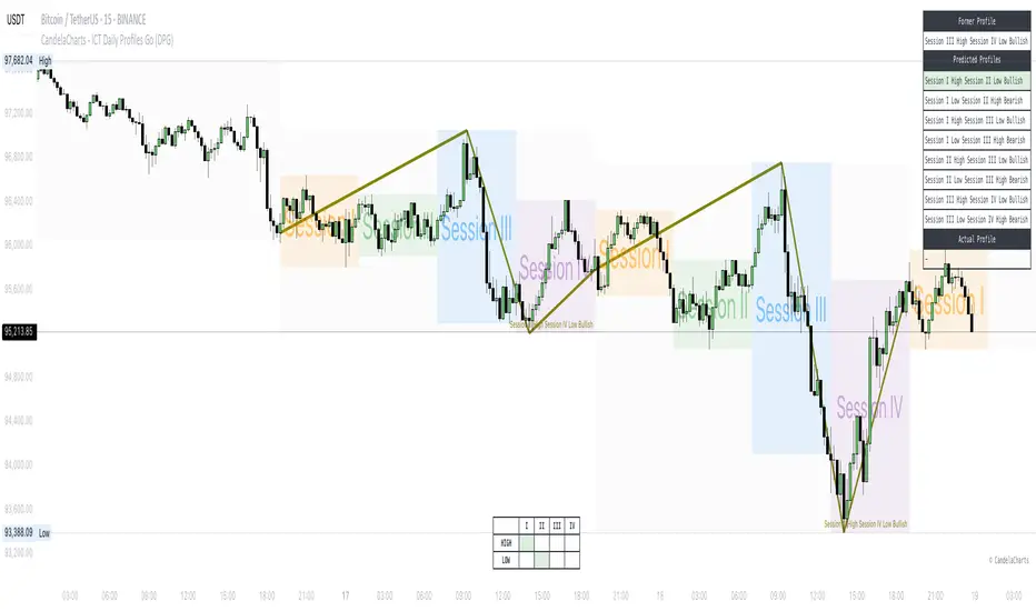
ICT (Inner Circle Trader) daily profile templates are analytical models that classify and outline common price action patterns observed throughout a trading day.
ICT Daily Profiles
Scanner
📒 Usage
The ICT Daily Profiles indicator aims to give traders a clear and actionable view of the Daily Previous, Current, and Future Profiles. This enables them to analyze market structure, predict price movements, and align their trading strategies with higher time-frame trends.
Load the indicator on the chart
Enable Scanner
See the Predicted Profiles list
Predicted Profiles represent all potential scenarios for the current day, generated by a profile detection algorithm.
By visualizing potential outcomes through Predicted Profiles, the ICT Daily Profiles indicator provides traders with a strategic edge, allowing them to remain flexible, prepared, and aligned with the most probable market movements.
🚨 Alerts
The indicator does not provide any alerts!
🔹 Notes
ICT Daily Profiles
pbs.twimg.com
⚠️ Disclaimer
Trading involves significant risk, and many participants may incur losses. The content on this site is not intended as financial advice and should not be interpreted as such. Decisions to buy, sell, hold, or trade securities, commodities, or other financial instruments carry inherent risks and are best made with guidance from qualified financial professionals. Past performance is not indicative of future results.
Search in scripts for "price action"
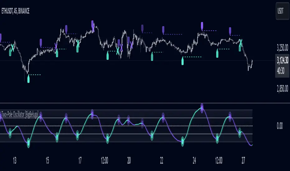
Two-Pole Oscillator [BigBeluga]
The Two-Pole Oscillator is an advanced smoothing oscillator designed to provide traders with precise market signals by leveraging deviation-based calculations combined with a unique two-pole filtering technique. It offers clear visual representation and actionable signals for smart trading decisions.
🔵Key Features:
Two-Pole Filtering: Smooths out the main oscillator signal to reduce noise, providing a cleaner and more reliable view of market momentum and trend strength.
// Two-pole smooth filter function
f_two_pole_filter(source, length) =>
var float smooth1 = na
var float smooth2 = na
alpha = 2.0 / (length + 1)
if na(smooth1)
smooth1 := source
else
smooth1 := (1 - alpha) * smooth1 + alpha * source
if na(smooth2)
smooth2 := smooth1
else
smooth2 := (1 - alpha) * smooth2 + alpha * smooth1
Deviation-Based Oscillator: Utilizes price deviations from the mean to generate dynamic signals, making it ideal for detecting overbought and oversold conditions.
float sma1 = ta.sma(close, 25)
float sma_n1 = ((close - sma1) - ta.sma(close - sma1, 25)) / ta.stdev(close - sma1, 25)
Signal Gradient Strength: Signals on the main oscillator line feature gradient coloring based on their proximity to the 0 level:
➔ Closer to 0: More transparent, indicating weaker signals.
➔ Closer to 1 or -1: Less transparent, highlighting stronger signals.
Level-Based Signal Validation: Parallel levels are plotted on the chart for each signal:
➔ If a level is crossed by price, the signal is invalidated, marked by an "X" at the invalidation point.
Trend Continuation
Invalidation Levels: Serve as potential stop-loss or trade-reversal zones, enabling traders to make more informed and disciplined trading decisions.
Dynamic Chart Plotting: Signals are plotted directly on the chart with corresponding levels, providing a comprehensive visual representation for easy interpretation.
🔵How It Works:
The oscillator calculates price deviation from a mean value and applies two-pole filtering to smooth the resulting signal.
Gradient-colored signals reflect their strength, with transparency indicating proximity to the 0 level on the oscillator scale.
Buy and sell signals are generated based on crossovers and crossunders of the oscillator line with a signal line.
If a level is crossed, the corresponding signal is marked with a "X" plotted on the chart at the crossover point.
🔵Use Cases:
Detecting overbought or oversold market conditions with a smoother, noise-free oscillator.
Using invalidation levels to set clear stop-loss or trade exit points.
Identifying strong momentum signals and filtering out weaker, less reliable ones.
Combining oscillator signals with price action for more precise trade entries and exits.
This indicator is perfect for traders seeking a refined approach to oscillator analysis, combining signal strength visualization with actionable invalidation levels to enhance trading precision and strategy.
Keltner Channel Width PercentileThe Keltner Channel Width Percentile (KCWP) is a volatility-focused indicator designed to measure the relative expansion and contraction of the Keltner Channel bands over time. By calculating the width of the Keltner Channels (difference between the upper and lower bands) and normalizing it as a percentage of the channel's basis, the KCWP provides a dynamic view of market conditions.
This indicator tracks how wide or narrow the Keltner Channel bands are relative to historical observations using a percentile-based approach. When the KCWP value is high (near 100%), it signals that the current channel width is at or near its historical maximum, often indicating heightened volatility or a potential reversal. Conversely, when the KCWP is low (near 0%), it suggests that the channel width is contracting, often preceding periods of reduced volatility or consolidation.
Key Features:
Percentile-Based Volatility Ranking: The KCWP assigns a percentile rank to the current Keltner Channel width, providing a clear, visual representation of where current volatility stands relative to the past.
Customizable Keltner Channels:
Length: Defines the period for the channel’s basis (middle line).
ATR Length: Adjusts the Average True Range (ATR) period used for band calculations.
Bands Style: Choose between Average True Range, True Range, or Range for calculating channel widths.
Dynamic Smoothing Options: Includes multiple moving average types (SMA, EMA, WMA, HMA, RMA, VWMA) and smoothing lengths for refining the raw percentile values, reducing noise while retaining responsiveness.
Visual Indicators:
Gradient coloring for the raw percentile line, transitioning from blue (low values) to green (mid-range) to red (high values), helps quickly assess market conditions.
A smoothed line for clarity and actionable signals.
Signal Zones:
80% High Line: Marks historically wide bands, signaling elevated volatility and potential exhaustion or trend continuation.
20% Low Line: Marks historically narrow bands, signaling calm conditions or consolidation, often before a breakout.
How to Use It:
Trend Continuation or Reversals: High KCWP values (above 80%) may indicate overextended volatility, hinting at possible trend exhaustion or continuation. This is often paired with price action for confirmation.
Breakout Readiness: Low KCWP values (below 20%) suggest tightening price ranges and reduced volatility, signaling potential breakout opportunities.
Complement to Keltner Channels: Use the KCWP alongside traditional Keltner Channels for a complete view of volatility and price behavior.
Customization for Your Trading Style:
The KCWP provides several user-adjustable inputs, including:
Percentile Lookback: Adjust how much historical data is used for ranking.
Smoothing Options: Customize the moving average type and length for the percentile line.
Channel and Band Calculations: Fine-tune the channel’s length, ATR length, and multiplier to match your preferred volatility sensitivity.
The Keltner Channel Width Percentile is a versatile and intuitive tool that helps traders monitor volatility dynamics, anticipate market transitions, and refine entry and exit strategies. Whether you're trading breakouts, trends, or consolidations, the KCWP provides actionable insights into the heartbeat of the market.

EBL - Enigma BOS LogicThe EBL - Enigma BOS Logic indicator is designed to detect key trend reversal points with precision by leveraging a unique concept based on two-candle price action analysis. Inspired by the balance of pairs in creation, this indicator identifies trend changes by focusing on significant bullish and bearish candle pairs, storing key levels, and waiting for confirmation to provide actionable trade signals. It goes beyond conventional trend-following indicators by offering real-time alerts and clear visual cues for traders.
How It Works
Bullish Setup:
The indicator identifies a bullish candle followed by a bearish candle. It then stores the high of the bullish candle as a potential reversal level.
A bullish confirmation occurs when a future bullish candle closes above the stored high. When this happens:
A green arrow is plotted below the confirming candle.
A horizontal green line is drawn at the stored high level, extending forward by a user-defined number of bars.
An alert is triggered to notify the trader of a confirmed bullish trend.
Bearish Setup:
The indicator identifies a bearish candle followed by a bullish candle. It stores the low of the bearish candle as a potential reversal level.
A bearish confirmation occurs when a future bearish candle closes below the stored low. When this happens:
A red arrow is plotted above the confirming candle.
A horizontal red line is drawn at the stored low level, extending forward by a user-defined number of bars.
An alert is triggered to notify the trader of a confirmed bearish trend.
Touch or Cross Alerts:
In addition to initial trend confirmation, the indicator tracks price movements relative to the drawn horizontal lines.
If the price returns to touch or cross a previously drawn horizontal line, an alert is triggered, indicating a potential re-entry or retracement opportunity.
Customization Options
To make the indicator versatile and adaptable for different trading styles, several customization options are provided:
Line Colors: Traders can customize the colors of the bullish and bearish lines.
Show/Hide Arrows and Lines: Users can choose whether to display the arrows and horizontal lines on the chart.
Line Length: The length of the horizontal lines (number of bars they extend into the future) is user-defined, offering flexibility based on trading timeframes and preferences.
Use Cases
Trend Reversal Detection: EBL is ideal for identifying key trend reversals, allowing traders to enter trades with a high probability of success.
Breakout Confirmation: The indicator provides visual and alert-based confirmation of breakouts beyond critical support or resistance levels.
Re-entry Opportunities: With alerts for price touching or crossing horizontal lines, traders can spot potential re-entry points during retracements.
Conceptual Foundation
The methodology behind this indicator is rooted in the principle that markets often move in pairs of bullish and bearish forces. By tracking the interaction between consecutive bullish and bearish candles and waiting for clear confirmations, this indicator ensures that only high-probability trend changes are signaled. This reduces noise and enhances trading accuracy, making it suitable for scalping, day trading, and swing trading across various timeframes.
How to Use
Apply the indicator to any chart and timeframe of your choice.
Set your preferred customization options, including line colors, arrow display, and line length.
Watch for arrows and listen for alerts to identify confirmed trend changes.
Pay attention to touch or cross alerts on horizontal lines, as these can signal potential re-entry or secondary trade opportunities.
Combine with other analysis: While EBL is powerful on its own, combining it with support/resistance analysis, moving averages, or volume indicators can further enhance its effectiveness.
This indicator is a powerful tool for traders seeking precision in identifying trend changes and actionable trade signals. Its unique logic, real-time alerts, and clear visual cues make it a valuable addition to any trader’s toolkit.
Leverage Aware Trade OptimizerWelcome to the Leverage-Aware Trade Optimizer (LATO)! I’m thrilled to have you exploring this dynamic algorithm! LATO combines advanced market oscillation tracking, leverage-aware trade optimization, and real-time market analysis to help you make smarter, more informed trading decisions. Whether you're just starting or you’re an experienced trader, LATO provides powerful tools and insights to enhance your strategies. LATO is here to support you in optimizing your trades with precision, so feel free to dive in and explore all the features. Let’s make your trading experience as effective and rewarding as possible. Safe trading!
Leverage-Aware Trade Optimizer (LATO)
Short Title: LATO
Category: Trading Tools / Technical Analysis
Overview
The Leverage-Aware Trade Optimizer (LATO) is a powerful algorithm designed to track and analyze market oscillations, identify reversal zones, and provide dynamic trading levels for optimal decision-making. With built-in risk management features, LATO enhances traders’ ability to make well-informed decisions based on a comprehensive range of market indicators, including price oscillations, probabilities, and leverage-related risks.
Key Features
Comprehensive Market Oscillation Tracking: LATO utilizes advanced indicators such as the Indexed Position Oscillator (IPO), Candle Relative Percentage (CRP), and Oscillating Range Indicator (ORI) to track price fluctuations and detect key market oscillations, providing a detailed view of price movements.
Dynamic Price Levels for Trading Decisions: The script calculates critical price levels such as WAP, WBP, XAP, and XBP. These weighted and expanded prices help identify potential support and resistance zones for accurate trade entries and exits.
Reversal Detection and Trend Identification: LATO is designed to recognize top and bottom reversal zones using user-defined thresholds (e.g., upper_reversal, lower_reversal). The algorithm signals potential trend changes with event markers such as UP, DOWN, UIP, and DIP, enabling traders to anticipate market reversals.
Risk and Leverage Mapping: By estimating liquidation levels for various leverage values (5x, 10x, 20x, etc.), LATO assists in risk management, helping traders visualize leverage exposure and optimize their trades according to risk tolerance.
Integrated Visualization and Event Labels: LATO enhances visual analysis by plotting key levels, trend lines, and event markers on the chart. Custom labels summarize critical values, including SOD (Sell Odds), BOD (Buy Odds), ORI (Oscillating Range Indicator), and PVI (Price Volatility Index), offering a quick, actionable summary for traders.
User Inputs
Orders Deviation (order_deviation): Controls the deviation for calculating trade levels.
Top Reversal (upper_reversal): Sets the threshold for the upper reversal zone.
Bottom Reversal (lower_reversal): Sets the threshold for the lower reversal zone.
How It Works
LATO tracks market oscillations through the Indexed Position Oscillator (IPO) and Candle Relative Percentage (CRP), dynamically adjusting as the market fluctuates. The algorithm then identifies key levels using weighted prices (e.g., WAP, WBP) and generates reversal signals based on defined thresholds.
Once the Leverage-Aware Trade Optimizer (LATO) is applied to a chart, it automatically calculates dynamic support and resistance levels and identifies potential buying or selling opportunities. The script also plots liquidation zones based on different leverage levels and visualizes these areas through color-coded lines.
Use Case Scenarios
Trend Reversal Detection: Identify when the market is likely to reverse based on the ORI and price action.
Dynamic Price Levels: Use the weighted price levels and trend lines to pinpoint entry/exit points.
Leverage Risk Management: Monitor liquidation levels and use them for managing risk while trading with leverage.
Oscillation Tracking: Track key oscillations for detecting overbought or oversold conditions.
Alert Setup for LATO
You can set up alerts based on the key conditions like UP, DOWN, UIP, and DIP, as well as specific market movements.
Down Trend Alert (DOWN): Alerts when there’s a downtrend, triggered by a crossover of WBP and BL5, with specific conditions for ORI and SOD.
Up Trend Alert (UP): Alerts when there’s an uptrend, triggered by a crossunder of WAP and SL5, with ORI below -0.5.
Upper Reversal Alert (UIP): Alerts when ORI crosses below the lower_reversal threshold.
Downward Reversal Alert (DIP): Alerts when ORI crosses above the upper_reversal threshold.
Conclusion
The Leverage-Aware Trade Optimizer (LATO) is a comprehensive trading tool designed for traders seeking to optimize their trade entries and exits. By combining multiple indicators, dynamic price levels, and reversal zone detection, LATO offers an advanced approach to market analysis and decision-making. Whether you’re trading with leverage or simply looking for trend confirmation, LATO provides the insights you need to maximize your trading potential.
Notes
This script is designed to be used on any time frame.
Adjust the order_deviation parameter based on the asset volatility you are trading.
The reversal thresholds (upper and lower) should be fine-tuned depending on market conditions.

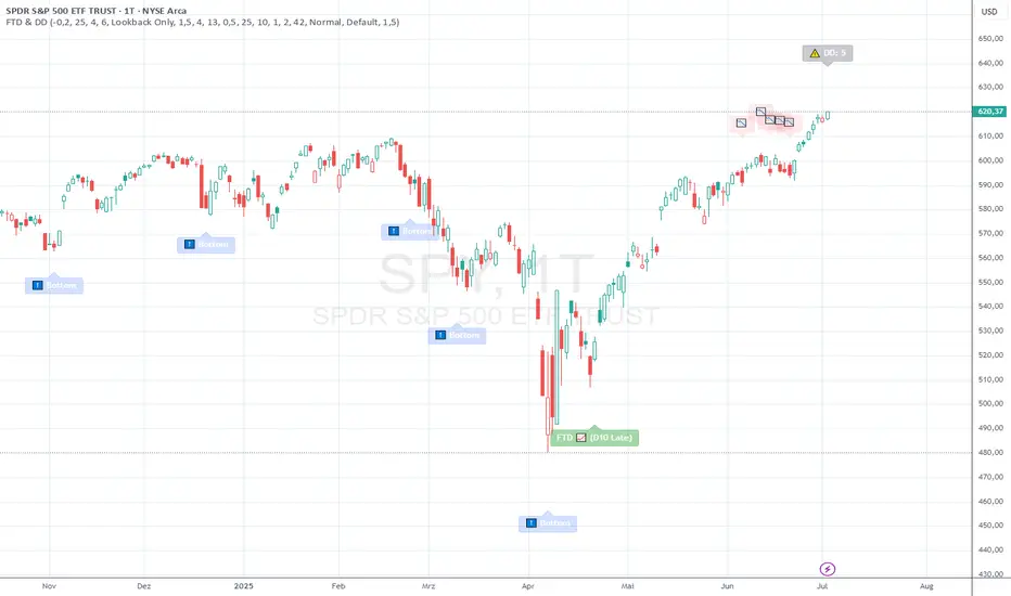
FTD & DD AnalyzerFTD & DD Analyzer
A comprehensive tool for identifying Follow-Through Days (FTDs) and Distribution Days (DDs) to analyze market conditions and potential trend changes, based on William J. O'Neil's proven methodology.
About the Methodology
This indicator implements the market analysis techniques developed by William J. O'Neil, founder of Investor's Business Daily and author of "How to Make Money in Stocks." O'Neil's research, spanning market data back to the 1880s, has successfully identified major market turns throughout history. His FTD and DD concepts remain crucial tools for institutional investors and serious traders.
Overview
This indicator helps traders identify two critical market conditions:
Distribution Days (DDs) - days of institutional selling pressure
Follow-Through Days (FTDs) - confirmation of potential market bottoms and new uptrends
The combination of these signals provides valuable insight into market health and potential trend changes.
Key Features
Distribution Day detection with customizable criteria
Follow-Through Day identification based on classical methodology
Market bottom detection using EMA analysis
Dynamic warning system for accumulated Distribution Days
Visual alerts with customizable labels
Advanced debug mode for detailed analysis
Flexible display options for different trading styles
Distribution Days Analysis
What is a Distribution Day?
A Distribution Day occurs when:
The price closes lower by a specified percentage (default -0.2%)
Volume is higher than the previous day
DD Settings
Price Threshold: Minimum price decline to qualify (default -0.2%)
Lookback Period: Number of days to analyze for DD accumulation (default 25)
Warning Levels:
First warning at 4 DDs
Severe warning (SOS - Sign of Strength) at 6 DDs
Display Options:
Show/hide DD count
Show/hide DD labels
Choose between showing all DDs or only within lookback period
Follow-Through Day Detection
What is a Follow-Through Day?
Following O'Neil's research, a Follow-Through Day confirms a potential market bottom when:
Occurs between day 4 and 13 after a bottom formation (optimal: days 4-7)
Shows significant price gain (default 1.5%)
Accompanied by higher volume than the previous day
Key Statistics:
FTDs followed by distribution on days 1-2 fail 95% of the time
Distribution on day 3 leads to 70% failure rate
Later distribution (days 4-5) shows only 30% failure rate
FTD Settings
Minimum Price Gain: Required percentage gain (default 1.5%)
Valid Window: Day 4 to Day 13 after bottom
Quality Rating:
🚀 for FTDs occurring within 7 days (historically most reliable)
⭐ for later FTDs
Market Bottom Detection
The indicator uses a sophisticated approach to identify potential market bottoms:
EMA Analysis:
Tracks 8 and 21-period EMAs
Monitors EMA alignment and momentum
Customizable tolerance levels
Price Action:
Looks for lower lows within specified lookback period
Confirms bottom with subsequent price action
Reset mechanism to prevent false signals
Visual Indicators
Label Types
📉 Distribution Days
⬇️ Market Bottoms
🚀/⭐ Follow-Through Days
⚠️ DD Warning Levels
Customization Options
Label size: Tiny, Small, Normal, Large
Label style: Default, Arrows, Triangles
Background colors for different signals
Dynamic positioning using ATR multiplier
Practical Usage
1. Monitor DD Accumulation:
Watch for increasing number of Distribution Days
Pay attention to warning levels (4 and 6 DDs)
Consider reducing exposure when warnings appear
2. Bottom Recognition:
Look for potential bottom formations
Monitor EMA alignment and price action
Wait for confirmation signals
3. FTD Confirmation:
Track days after potential bottom
Watch for strong price/volume action in valid window
Note FTD quality rating for additional context
Alert System
Built-in alerts for:
New Distribution Days
Follow-Through Day signals
High DD accumulation warnings
Tips for Best Results
Use multiple timeframes for confirmation
Combine with other market health indicators
Pay attention to sector rotation and market leadership
Monitor volume patterns for confirmation
Consider market context and external factors
Technical Notes
The indicator uses advanced array handling for DD tracking
Dynamic calculations ensure accurate signal generation
Debug mode available for detailed analysis
Optimized for real-time and historical analysis
Additional Information
Compatible with all markets and timeframes
Best suited for daily charts
Regular updates and maintenance
Based on O'Neil's time-tested market analysis principles
Conclusion
The FTD & DD Analyzer provides a systematic approach to market analysis, combining O'Neil's proven methodologies with modern technical analysis. It helps traders identify potential market turns while monitoring institutional participation through volume analysis.
Remember that no indicator is perfect - always use in conjunction with other analysis tools and proper risk management.
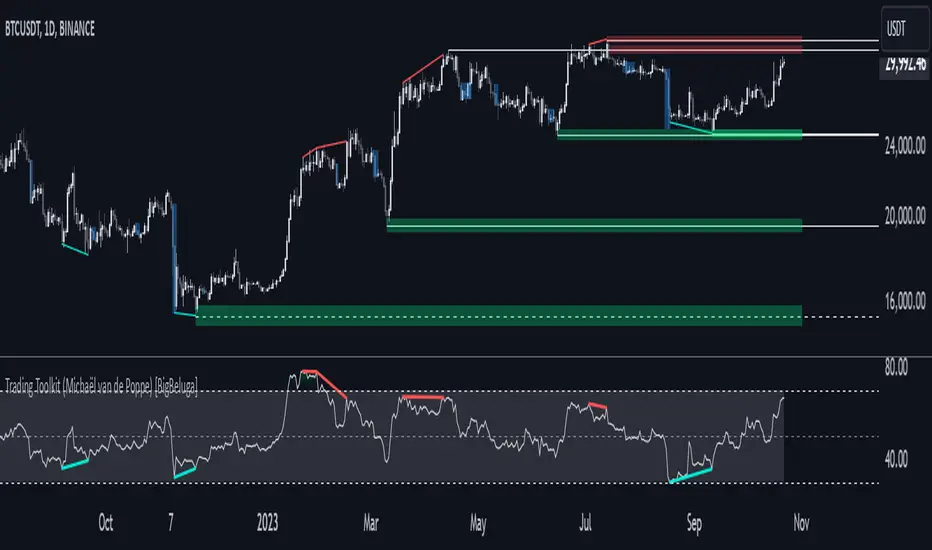
Comprehensive Trading Toolkit [BigBeluga]Trading Toolkit is a comprehensive indicator inspired by the trading strategies of the renowned crypto influencer Michaël van de Poppe . This tool combines RSI divergences, correction zones, and advanced support/resistance levels to provide traders with a robust framework for analyzing market movements.
🔵 Key Features:
RSI Divergences on Chart:
Automatically identifies and plots RSI divergences (bullish and bearish) directly on the main price chart.
Green lines indicate bullish divergences, suggesting potential upward reversals.
Red lines indicate bearish divergences, signaling possible downward movements.
Correction Boxes:
Traders typically define a correction as a drop in value of 10% or more. This drop can happen over a few hours or a few days. Also, it can last for less than 24 hours or many months.
This indicator visualizes corrections with blue shaded boxes, triggered by a percentage decline defined in the settings.
The boxes highlight sharp price drops, helping traders identify significant market movements quickly.
Advanced Support and Resistance Levels:
Dynamically detects key support and resistance levels based on price pivots.
When the price is above a level, it plots a green shaded area from the cross point, marking support.
When the price drops below a level, it plots a red shaded area, highlighting resistance.
Dashed lines indicate weaker levels, while solid lines represent stronger, more reliable levels.
🔵 Usage:
Identify Divergences: Use plotted RSI divergences to detect potential market reversals and align them with price action.
Analyze Correction Zones: Utilize correction boxes to evaluate significant price declines and find potential buying opportunities during these corrections.
Leverage Support and Resistance Levels: Confirm breakouts, reversals, or consolidation zones with the color-coded areas.
Enhance Risk Management: Combine divergences and correction zones to set informed stop-loss or take-profit levels.
Trading Toolkit empowers traders with actionable insights into market trends, corrections, and support/resistance dynamics, making it an invaluable tool for crypto and forex markets.
Advanced Divergence IndicatorAdvanced Divergence Indicator
Unlock the full potential of your trading strategy with the Advanced Divergence Indicator, a powerful tool designed to identify and analyze bullish and bearish divergences using multiple technical indicators. Whether you're a seasoned trader or just starting out, this indicator provides clear, actionable signals to help you make informed trading decisions.
What It Does
The Advanced Divergence Indicator detects divergences between price movements and key technical indicators, specifically the Relative Strength Index (RSI) and On-Balance Volume (OBV). Divergence occurs when the price trends in one direction while the indicator trends in the opposite direction, signaling potential reversals or continuations in the market.
Key Features
Multi-Indicator Analysis
RSI Divergence: Identifies bullish and bearish divergences using the RSI, helping you spot potential reversals based on momentum.
OBV Divergence: Utilizes OBV to detect divergences related to volume flow, providing insights into the strength behind price movements.
Bullish and Bearish Signals
Bullish Divergence: Signals when indicators show higher lows while the price forms lower lows, suggesting a potential upward reversal.
Bearish Divergence: Alerts when indicators display lower highs while the price creates higher highs, indicating a possible downward reversal.
Signal Strength Classification
Standard Signals: Represent typical divergence occurrences, marked with green (bullish) and red (bearish) labels.
Strong Signals: Highlighted with yellow (strong bullish) and blue (strong bearish) labels when divergences coincide with overbought or oversold conditions, enhancing signal reliability.
Customizable Settings
Indicator Selection: Choose to enable RSI, OBV, or both based on your trading preferences.
Pivot Points: Adjust the number of bars left and right to fine-tune pivot detection for more accurate divergence identification.
Range Configuration: Set minimum and maximum bar ranges to control the sensitivity of divergence detection, suitable for different timeframes and trading styles.
Noise Cancellation: Reduce false signals by enabling noise filtering, ensuring that only significant divergences are highlighted.
Visual Clarity
Color-Coded Labels: Easily distinguish between different types of divergences with intuitive color codes—green for bullish, red for bearish, yellow for strong bullish, and blue for strong bearish signals.
Clean Chart Display: The indicator overlays seamlessly on your chart without clutter, ensuring that signals are easily identifiable without distracting from price action.
Real-Time Alerts
Custom Alert Conditions: Receive instant notifications for bullish and bearish divergences, enabling you to act promptly on potential trading opportunities.
Combined Alerts: Get alerts for either bullish or bearish signals, or both, based on your selected criteria.
How to Use
Add the Indicator to Your Chart
Apply the Advanced Divergence Indicator to your desired chart and timeframe.
Configure Settings
Select Indicators: Choose to enable RSI, OBV, or both under the "Indicator Settings" group.
Adjust Parameters: Customize RSI length, pivot points, and divergence ranges to match your trading strategy and the specific asset you are analyzing.
Enable Noise Cancellation: Activate this feature to filter out minor divergences and focus on more significant signals.
Interpret the Signals
Bullish Signals: Look for green or yellow labels below the price bars indicating potential upward reversals.
Bearish Signals: Identify red or blue labels above the price bars signaling possible downward reversals.
Strong Signals: Pay special attention to yellow and blue labels as they denote stronger divergences with higher reliability.
Set Up Alerts
Configure alert conditions within the indicator to receive real-time notifications when bullish or bearish divergences are detected, ensuring you never miss a trading opportunity.
Why Choose Advanced Divergence Indicator
Comprehensive Analysis : By combining RSI and OBV, the indicator provides a more robust analysis compared to single-indicator tools, enhancing the accuracy of divergence detection.
Flexibility : Highly customizable settings allow traders to tailor the indicator to their unique strategies and market conditions.
User-Friendly : Clear labels and color codes make it easy for traders of all levels to understand and act on the signals.
Reliability : Strong signal classification and noise cancellation features help reduce false positives, providing more trustworthy trading signals.

WD Gann: Close Price X Bars Ago with Line or Candle PlotThis indicator is inspired by the principles of WD Gann, a legendary trader known for his groundbreaking methods in time and price analysis. It helps traders track the close price of a security from X bars ago, a technique that is often used to identify key price levels in relation to past price movements. This concept is essential for Gann’s market theories, which emphasize the relationship between time and price.
WD Gann’s analysis often revolved around specific numbers that he considered significant, many of which correspond to squared numbers (e.g., 1, 4, 9, 16, 25, 36, 49, 64, 81, 100, 121, 144, 169, 196, 225, 256, 289, 324, 361, 400, 441, 484, 529, 576, 625, 676, 729, 784, 841, 900, 961, 1024, 1089, 1156, 1225, 1296, 1369, 1444, 1521, 1600, 1681, 1764, 1849, 1936). These numbers are believed to represent natural rhythms and cycles in the market. This indicator can help you explore how past price levels align with these significant numbers, potentially revealing key price zones that could act as support, resistance, or reversal points.
Key Features:
- Historical Close Price Calculation: The indicator calculates and displays the close price of a security from X bars ago (where X is customizable). This method aligns with Gann's focus on price relationships over specific time intervals, providing traders with valuable reference points to assess market conditions.
- Customizable Plot Type: You can choose between two plot types for visualizing the historical close price:
- Line Plot: A simple line that represents the close price from X bars ago, ideal for those who prefer a clean and continuous representation.
- Candle Plot: Displays the close price as a candlestick chart, providing a more detailed view with open, high, low, and close prices from X bars ago.
- Candle Color Coding: For the candle plot type, the script color-codes the candles. Green candles appear when the close price from X bars ago is higher than the open price, indicating bullish sentiment; red candles appear when the close is lower, indicating bearish sentiment. This color coding gives a quick visual cue to market sentiment.
- Customizable Number of Bars: You can adjust the number of bars (X) to look back, providing flexibility for analyzing different timeframes. Whether you're conducting short-term or long-term analysis, this input can be fine-tuned to suit your trading strategy.
- Gann Method Application: WD Gann's methods involved analyzing price action over specific time periods to predict future movements. This indicator offers traders a way to assess how the price of a security has behaved in the past in relation to a chosen time interval, a critical concept in Gann's theories.
How to Use:
1. Input Settings:
- Number of Bars (X): Choose the number of bars to look back (e.g., 100, 200, or any custom period).
- Plot Type: Select whether to display the data as a Line or Candles.
2. Interpretation:
- Using the Line plot, observe how the close price from X bars ago compares to the current market price.
- Using the Candles plot, analyze the full price action of the chosen bar from X bars ago, noting how the close price relates to the open, high, and low of that bar.
3. Gann Analysis: Integrate this indicator into your broader Gann-based analysis. By looking at past price levels and their relationship to significant squared numbers, traders can uncover potential key levels of support and resistance or even potential reversal points. The historical close price can act as a benchmark for predicting future market movements.
Suggestions on WD Gann's Emphasis in Trading:
WD Gann’s trading methods were rooted in several key principles that emphasized the relationship between time and price. These principles are vital to understanding how the "Close Price X Bars Ago" indicator fits into his overall analysis:
1. Time Cycles: Gann believed that markets move in cyclical patterns. By studying price levels from specific time intervals, traders can spot these cycles and predict future market behavior. This indicator allows you to see how the close price from X bars ago relates to current market conditions, helping to spot cyclical highs and lows.
2. Price and Time Squaring: A core concept in Gann’s theory is that certain price levels and time periods align, often marking significant reversal points. The squared numbers (e.g., 1, 4, 9, 16, 25, etc.) serve as potential key levels where price and time might "square" to create support or resistance. This indicator helps traders spot these historical price levels and their potential relevance to future price action.
3. Geometric Angles: Gann used angles (like the 45-degree angle) to predict market movements, with the belief that prices move at specific geometric angles over time. This indicator gives traders a reference for past price levels, which could align with key angles, helping traders predict future price movement based on Gann's geometry.
4. Numerology and Key Intervals: Gann paid particular attention to numbers that held significance, including squared numbers and numbers related to the Fibonacci sequence. This indicator allows traders to analyze price levels based on these key numbers, which can help in identifying potential turning points in the market.
5. Support and Resistance Levels: Gann’s methods often involved identifying levels of support and resistance based on past price action. By tracking the close price from X bars ago, traders can identify past support and resistance levels that may become significant again in future market conditions.
Perfect for:
Traders using WD Gann’s methods, such as Gann angles, time cycles, and price theory.
Analysts who focus on historical price levels to predict future price action.
Those who rely on numerology and geometric principles in their trading strategies.
By integrating this indicator into your trading strategy, you gain a powerful tool for analyzing market cycles and price movements in relation to key time intervals. The ability to track and compare the historical close price to significant numbers—like Gann’s squared numbers—can provide valuable insights into potential support, resistance, and reversal points.
Disclaimer:
This indicator is based on the methods and principles of WD Gann and is for educational purposes only. It is not intended as financial advice. Trading involves significant risk, and you should not trade with money that you cannot afford to lose. Past performance is not indicative of future results. The use of this indicator is at your own discretion and risk. Always do your own research and consider consulting a licensed financial advisor before making any investment decisions.

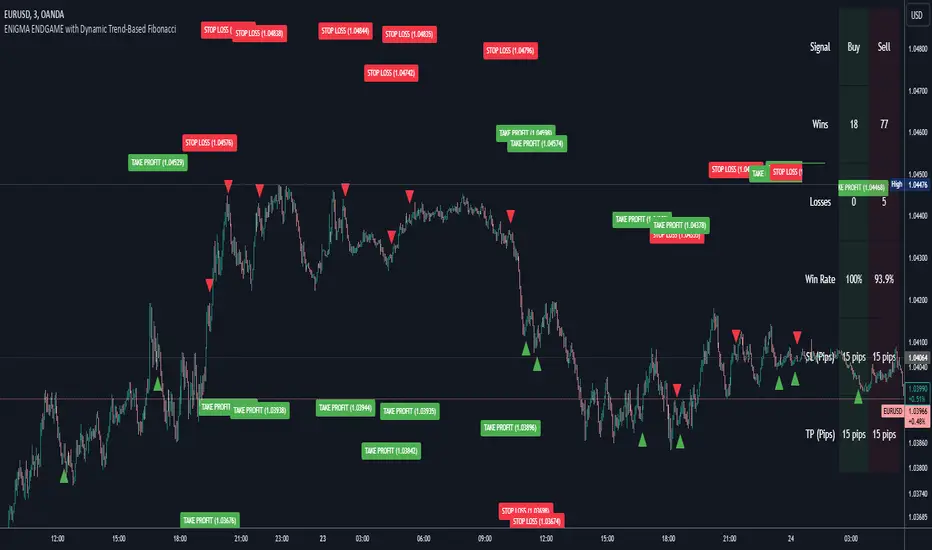
Enigma Endgame with Dynamic Trend-Based FibonacciThe Enigma Endgame script combines dynamic trend-based Fibonacci levels with the core principles of the ENIGMA strategy. It provides traders with actionable signals by identifying key levels of fractal support and resistance and highlighting opportunities to trade with market momentum. This tool is designed for multi-timeframe analysis and is especially effective during high-volatility sessions like London and New York.
Purpose and Usefulness
This script was developed to simplify complex market dynamics by integrating Fibonacci principles with ENIGMA's logic of fractal support and resistance. Traders can use it to:
- Identify key breakout and retracement levels dynamically.
- Understand the shift between support and resistance as price action evolves.
- Gain confidence in their entries with real-time signals derived from logical fractal behavior.
By merging Fibonacci levels with fractal-based trading insights, this script offers a unique and comprehensive approach to analyzing market structure.
How It Works
The script uses a dual approach to provide insights:
1. Dynamic Fibonacci Levels:
- Automatically plots Fibonacci retracement and extension levels based on recent high and low swings, adjusting dynamically to current market trends.
- Allows traders to visualize key levels where price might reverse or extend.
2. Fractal Support and Resistance Logic:
- The script identifies fractal support and resistance by analyzing candle formations.
- When a candle body closes below the low of a previous candle, the previous low, which was fractal support, now becomes fractal resistance. The script generates a bearish signal, encouraging traders to look for sell opportunities at or above the previous low.
- Conversely, when a candle body closes above the high of a previous candle, the previous high, which was fractal resistance, becomes fractal support. The script generates a bullish signal, encouraging traders to look for buy opportunities at or below the previous high.
Real-Time Signals
The script marks these transitions with arrows on the chart:
- Bearish arrows indicate broken fractal support turning into resistance.
- Bullish arrows** indicate broken fractal resistance turning into support.
These signals help traders stay aligned with the trend and trade with market momentum.
Key Features
1. Session-Based Analysis: Focuses on high-probability setups by allowing traders to customize session times, such as London or US sessions.
2. Multi-Timeframe Support: Works seamlessly across multiple timeframes for both scalpers and swing traders.
3. Real-Time Alerts: Sends customizable alerts when price interacts with critical Fibonacci levels or fractal support/resistance shifts.
How to Use the Script
1. Apply the script to a clean chart for clear visualization. Avoid combining it with other scripts unless necessary.
2. Use the arrows to identify shifts in fractal support and resistance and validate opportunities for buy/sell trades.
3. Monitor the dynamic Fibonacci levels to find confluence with key price areas.
4. Customize session times to focus on high-probability trading hours.
Key Notes for Traders
- This script provides insights based on logical market structure but should be used alongside proper risk management and trading plans.
- The fractal-based approach works well in conjunction with dynamic Fibonacci levels, helping traders build confidence in their strategy.
- Adapt the script settings to match your unique trading style and timeframe preferences.
By offering a seamless integration of fractal logic and Fibonacci principles, Enigma Endgame empowers traders with actionable insights to navigate markets effectively.
Super Oscillator with Alerts by BigBlueCheeseSuper Oscillator with Alerts (by BigBlueCheese)
I got sick of eyeballing multiple oscillators generating output on different scales and interpreting them on the fly, so I picked 4 of my favs, 2 fisher transforms (fast & slow) The Squeeze & my own Market Rhythm Oscillator & made the Super Oscillator with Alerts which combines multiple indicators and oscillators to analyze market conditions and generate actionable trading signals.
The output is buy/sell/neutral signals and a color coded table summarizing indicator states (strong buy to strong sell etc). The color legend can be disabled once you get used to the color codes. The user can choose to watch the table output and its changing output, OR unclutter their screen by toggling the table off & just watching for the signals SO+ (buy), SO-(sell), SO?(neutral)
The combined signals are run through a scoring and weighting scheme that utilizes each indicators Z-scores, Min-Max normalization, and raw values which are all used in different parts of the scoring process.
A velocity filter (for more immediate/sensitive response) is available for the user to toggle on/off. The raw indicator values are classified into categories reflecting their current strength and are assigned momentum points.
Z-scores measure how far each oscillator's current value deviates from its mean in terms of standard deviations. Basically, the Z-scores focus on relative behavior, while momentum captures directional trends. Together, they provide a more nuanced view of market conditions. Large Z-scores increase the likelihood of stronger signals. The idea is to are amplify influence in extreme conditions whereas low Z scores will have minimal impact on the cumulative score, making signals less prone to noise.
Inputs and Their Contributions
1. Momentum: Controlled by the raw oscillator values and thresholds.
2. Min-Max: Automatically calculated based on the historical range of oscillators.
3. Velocity: Input: useVelocity (true/false) toggle. Weights: User-defined weights for velocity contribution.
4. Z-Score: Input: useZScore (true/false) toggle. Weights: User-defined weights for Z-score contribution.
The system combines momentum, Min-Max normalization, (and if enabled) velocity, and Z-scores, to generate dynamic and actionable trading signals that appear as markers on the chart indicating buy, sell, and neutral signals.
Alerts can also be triggered based on these signals.
Users can customize the weighting and inclusion of velocity and Z-scores to align the scoring system with their trading strategy and preferences.
If there is enough interest for some other preferred oscillator, I will substitute it for out my Market Rhythm Oscillator & republish with the code. LMK
For the curious out there, the Market Rhythm Oscillator (MRO) is a custom oscillator that analyzes price dynamics using a combination of weighted volatility-based calculations. It helps measure price momentum and potential exhaustion levels by identifying high and low volatility regions.
• Purpose: The MRO is particularly effective at identifying market trends and potential reversals by analyzing price extremes and their behavior over a defined lookback period.
• Calculation Components might include:
o Waveform Volatility Factor (WVF): Measures the price's deviation from its highest or lowest values within a given period.
o Bands and Smoothing:
Upper and lower bands based on standard deviations of WVF.
Smoothing is applied to the WVF for better trend clarity.
o Exhaustion Levels: Uses the MRO's trend length to calculate when the price action may become overextended.
Happy hunting but as always, not a trade recommendation, past results not indicative of future results, DYOR!

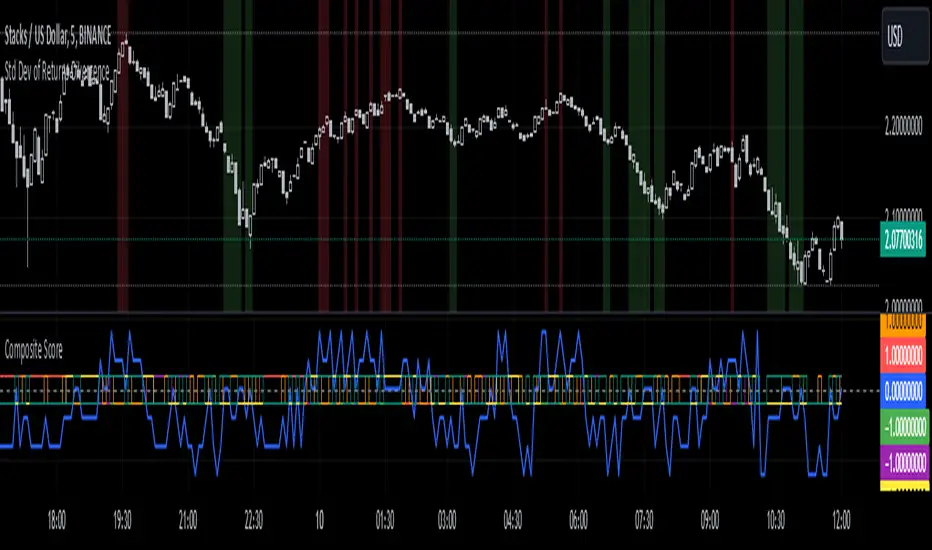
Standard Deviation of Returns: DivergencePurpose:
The "Standard Deviation of Returns: Divergence" indicator is designed to help traders identify potential trend reversals or continuation signals by analyzing divergences between price action and the statistical volatility of returns. Divergences can signal weakening momentum in the prevailing trend, offering insight into potential buying or selling opportunities.
Key Components
1. Returns Calculation:
* The indicator uses logarithmic returns (log(close / close )) to measure relative price changes in a normalized manner.
* Log returns are more effective than simple price differences when analyzing data across varying price levels, as they account for percentage-based changes.
2. Standard Deviation of Returns:
* The script computes the standard deviation of returns over a user-defined lookback period (ta.stdev(returns, lookback)).
* Standard deviation measures the dispersion of returns around their average, effectively quantifying market volatility.
* A higher standard deviation indicates increased volatility, while lower standard deviation reflects a calmer market.
3. Price Action:
* Detects higher highs (new peaks in price) and lower lows (new troughs in price) over the lookback period.
* Price trends are compared to the behavior of the standard deviation.
4. Divergence Detection:
A divergence occurs when price action (higher highs or lower lows) is not confirmed by a corresponding movement in standard deviation:
Bullish Divergence: Price makes a lower low, but the standard deviation does not, signaling potential upward momentum.
Bearish Divergence: Price makes a higher high, but the standard deviation does not, signaling potential downward momentum.
5. Visual Cues:
The script highlights divergence regions directly on the chart:
Green Background: Indicates a bullish divergence (potential buy signal).
Red Background: Indicates a bearish divergence (potential sell signal).
How It Works
Inputs:
* The user specifies the lookback period (lookback) for calculating the standard deviation and detecting divergences.
Calculation:
* Each bar’s returns are computed and used to calculate the standard deviation over the specified lookback period.
* The indicator evaluates price highs/lows and compares these with the highest and lowest values of the standard deviation within the same lookback period.
Highlight of Divergences:
When divergences are detected:
Bullish Divergence: The background of the chart is shaded green.
Bearish Divergence: The background of the chart is shaded red.
Trading Application
Bullish Divergence:
* Occurs when the market is oversold, or downward momentum is weakening.
* Suggests a potential reversal to an uptrend, signaling a buying opportunity.
Bearish Divergence:
* Occurs when the market is overbought, or upward momentum is weakening.
* Suggests a potential reversal to a downtrend, signaling a selling opportunity.
Contextual Use:
* Use this indicator in conjunction with other technical tools like RSI, MACD, or moving averages to confirm signals.
* Effective in volatile or ranging markets to help anticipate shifts in momentum.
Summary
The "Standard Deviation of Returns: Divergence" indicator is a robust tool for spotting divergences that can signal weakening market trends. It combines statistical volatility with price action analysis to highlight key areas of potential reversals. By integrating this tool into your trading strategy, you can gain additional confirmation for entries or exits while keeping a close watch on momentum shifts.
Disclaimer: This is not a financial advise; please consult your financial advisor for personalized advice.
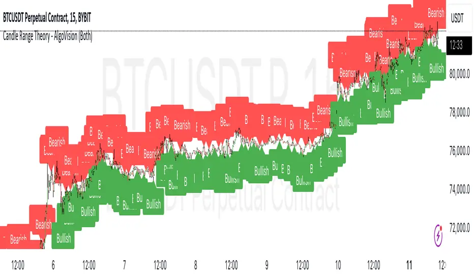
Candle Range Theory - AlgoVisionUnderstanding Candle Range Theory (CRT) in the AlgoVision Indicator
Candle Range Theory (CRT) is a structured approach to analyzing market movements within the price ranges of candlesticks. CRT is founded on the idea that each candlestick on a chart, regardless of timeframe, represents a distinct range of price action, marked by the candle's open, high, low, and close. This range gives insights into market dynamics, and when analyzed in lower timeframes, reveals patterns that indicate underlying market sentiment and institutional behaviors.
Key Concepts of Candle Range Theory
Candlestick Range: The range of a candlestick is simply the distance between its high and low. Across timeframes, this range highlights significant price behavior, with each candlestick representing a snapshot of price movement. The body (distance between open and close) shows the primary price action, while wicks (shadows) reflect price fluctuations or "noise" around this movement.
Multi-Timeframe Analysis: A higher-timeframe (HTF) candlestick can be dissected into smaller, structured price movements in lower timeframes (LTFs). By analyzing these smaller movements, traders gain a detailed view of the market’s progression within the HTF candlestick’s range. Each HTF candlestick’s high and low provide support and resistance levels on the LTF, where the price can "sweep," break out, or retest these levels.
Market Behavior within the Range: Price action within a range doesn’t move randomly; it follows structured behavior, often revealing patterns. By analyzing these patterns, CRT provides insights into the market’s intention to accumulate, manipulate, or distribute assets within these ranges. This behavior can indicate future market direction and increase the probability of accurate trading signals.
CRT and ICT Power of 3: Accumulation, Manipulation, and Distribution (AMD)
A foundational element of our CRT indicator is its combination with ICT’s Power of 3 (Accumulation, Manipulation, and Distribution or AMD). This approach identifies three stages of market movement:
Accumulation: During this phase, institutions accumulate positions within a tight price range, often leading to sideways movement. Here, price consolidates as institutions carefully enter or exit positions, erasing traces of their intent from public view.
Manipulation: Institutions often use manipulation to create false breakouts, targeting retail traders who enter the market on perceived breakouts or reversals. Manipulation is characterized by liquidity grabs, false breakouts, or stop hunts, as price momentarily moves outside the established range before quickly returning.
Distribution: Following accumulation and manipulation, the distribution phase aligns with the true market direction. Institutions now allow the market to move with the trend, initiating a stronger and more sustained price movement that aligns with their intended position.
This AMD cycle is often observed across multiple timeframes, allowing traders to refine entries and exits by identifying accumulation, manipulation, and distribution phases on smaller timeframes within the range of a higher-timeframe candle. CRT views this cycle as the "heartbeat" of the market—a continuous loop of price movements. With our indicator, you can identify this cycle on your current timeframe, with the signal candle acting as the "manipulation" candle.
How to Use the AlgoVision CRT Indicator
The AlgoVision CRT Indicator is designed to assist traders in identifying actionable points within the candle range framework. Our indicator operates by generating signals on the close of the second candle, setting up the expectation to trade the third candle as the "manipulation" candle. This is where price movement in a targeted direction typically occurs. Once you receive a signal on candle two's close, you can prepare to execute a trade on the next candle based on the manipulation phase within the CRT framework.
By setting alerts on a higher timeframe, you can receive either bullish or bearish signals that prepare you to enter trades on a lower timeframe. For instance, a bullish signal on the higher timeframe may signal to watch for a setup on the lower timeframe, allowing for precision entries during the accumulation or manipulation phases.
Conclusion By combining CRT with ICT Power of 3, the AlgoVision Indicator allows traders to leverage the CRT candlestick as a versatile tool for identifying potential market moves. This method provides beginners and seasoned traders alike with a robust framework to understand market dynamics and refine trade strategies across timeframes. Setting alerts on the higher timeframe to catch bullish or bearish CRT signals allows you to plan and execute trades on the lower timeframe, aligning your strategy with the broader market flow.
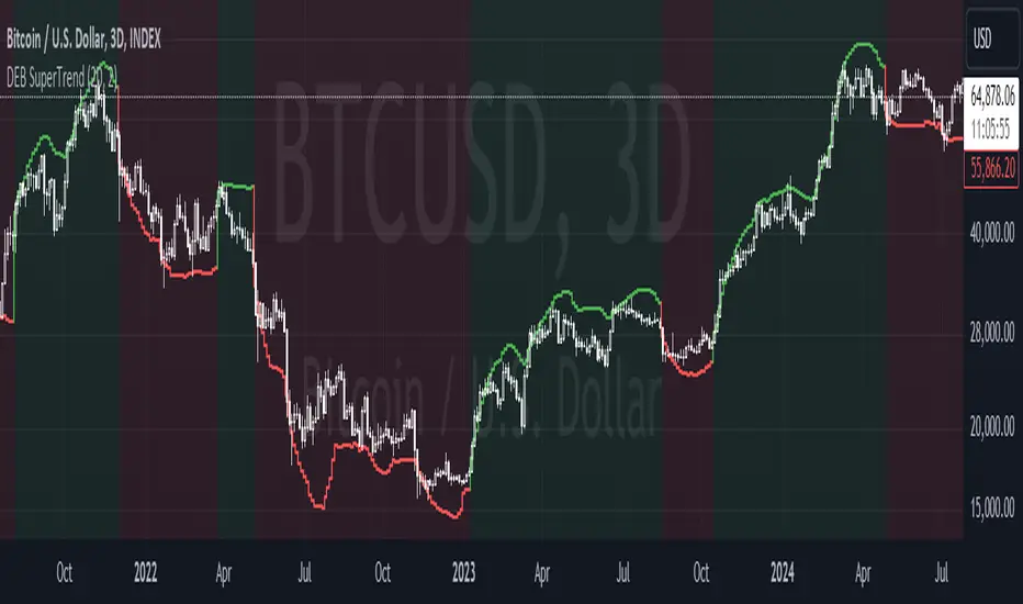
DEB SuperTrend [Mattes]The Dynamic Envelope Based Supertrend integrates two key concepts: dynamic envelopes and the Supertrend, creating a powerful trend-following tool. Understanding its functionality requires a closer look at how the envelopes are constructed and how they interact with price action.
Dynamic Envelopes
>>> Dynamic envelopes are bands that surround a central moving average (MA) which is set by the user. These are then calculated based on the standard deviation of price movements over a specified period. The formula for the upper and lower envelopes is as follows:
Upper Envelope=MA+(Multiplier×STD)
Lower Envelope=MA−(Multiplier×STD)
This dynamic approach ensures that the envelopes expand and contract based on market volatility. In periods of high volatility, the envelopes widen, allowing for more price movement without triggering false signals. Conversely, in low-volatility periods, the envelopes tighten, enhancing sensitivity to price changes.
Interaction with the Supertrend
The Supertrend component is a trend-following indicator that utilizes the concept of Average True Range (ATR) to define its trailing stop levels.
In this indicator however (like I've mentioned before), the ATR bands have been replaced with the STD envelopes, as they offer a better performance compared to ATR bands.
Trend Direction
The Supertrend indicator generates buy and sell signals based on price crossing the calculated upper and lower envelopes:
>>> Buy Signal: Triggered when the price closes above the upper envelope, indicating a potential upward trend.
>>> Sell Signal: Triggered when the price closes below the lower envelope, suggesting a downward trend.
Adaptive Nature:
The dynamic envelopes effectively serve as dynamic support and resistance levels, which adapt to price movements and volatility, while the Supertrend tracks these levels to confirm the trend direction and adjust accordingly to changes, making it an enhanced version of ATR Based Supertrends.
Unique Aspects and Advantages
->>>> The Dynamic Envelope Based Supertrend is unique for several reasons:
>>> Volatility Responsiveness: The indicator adjusts its sensitivity based on market conditions, reducing the likelihood of false signals during quiet market phases and improving reliability during volatile periods. This is reasoned by the STD envelope bands contracting and expanding relative to the tickers performance.
>>> Trend Confirmation: By integrating the Supertrend logic, the indicator not only provides entry signals but also guides traders on when to exit, maintaining a focus on trend-following rather than mean reversion.
>>> Stability: Due to its use of Standard deviation envelopes, it is very ressistant in periods of uncertainty, Rather than buy bottom and selling tops, it stays long/short for the complete period of mean reverting environments, which is based on the bigger and fuller trend direction on the larger timescales.
>>> Clear Signals: The indicator simplifies decision-making by offering visual cues through its envelopes and trend signals, making it accessible to traders of all experience levels.
Summary:
The Dynamic Envelope Based Supertrend is a sophisticated trend-following indicator that intelligently combines dynamically adjusted STD envelopes with Supertrend logic. By incorporating volatility metrics, it offers a clear and actionable framework for traders, enhancing their ability to identify and follow trends effectively.
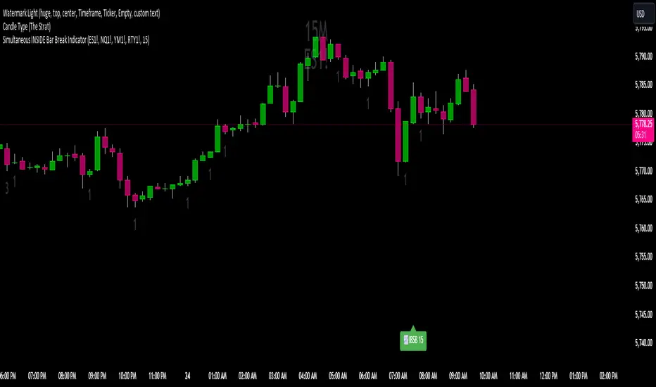
Simultaneous INSIDE Bar Break IndicatorSimultaneous Inside Bar Break Indicator (SIBBI) for The Strat Community
Overview:
The Simultaneous Inside Bar Break Indicator (SIBBI) is designed to help traders using The Strat methodology identify one of the most powerful breakout patterns: the Simultaneous Inside Bar Break across multiple symbols. This indicator detects when all four user-selected symbols form inside bars on the previous candle and then break those inside bars in the same direction (either bullish or bearish) on the current candle.
Inside bars represent consolidation periods where price action does not break the high or low of the previous candle. When a simultaneous break occurs across multiple symbols, this often signals a strong move in the market, making this a key actionable signal in The Strat trading strategy.
Key Features:
Multi-Symbol Analysis: You can track up to four different symbols simultaneously. By default, the indicator comes with SPY, QQQ, IWM, and DIA, but you can modify these to track any other assets or symbols.
Inside Bar Detection: The indicator checks whether all four symbols have inside bars on the previous candle. It only triggers when all symbols meet this condition, making it a highly specific and reliable signal.
Simultaneous Break Detection: Once all symbols have inside bars, the indicator waits for a breakout in the same direction across all four symbols. A simultaneous bullish break (prices breaking above the previous candle’s high) triggers a green label, while a simultaneous bearish break (prices breaking below the previous candle’s low) triggers a red label.
Dynamic Label Timeframe: The indicator dynamically adjusts the timeframe in the label based on the user’s selected timeframe. This allows traders to know precisely which timeframe the break is occurring on. If the user selects "Chart Timeframe," the indicator will evolve with the current chart's timeframe, making it more versatile.
Timeframe Flexibility: The indicator can be set to analyze any timeframe—15-minute, 30-minute, 60-minute, daily, weekly, and so on. It only works for the specific timeframe you set it to in the settings. If set to "Chart Timeframe," the label will adapt dynamically based on the timeframe you are currently viewing.
Customizable Labels: The user can choose the size of the labels (tiny, small, or normal), ensuring that the visual output is tailored to individual preferences and chart layouts.
Best Use Case:
The Simultaneous Inside Bar Break Indicator is particularly powerful when applied to multiple timeframes. Here’s how to use it for maximum impact:
Multi-Timeframe Setup: Set the indicator on various timeframes (e.g., 15-minute, 30-minute, 60-minute, and daily) across multiple charts. This allows you to monitor different timeframes and identify when lower timeframe breaks trigger potential moves on higher timeframes.
Anticipating Strong Moves: When a simultaneous inside bar break occurs on one timeframe (e.g., 30-minute), keep an eye on the higher timeframes (e.g., 60-minute or daily) to see if those timeframes also break. This stacking of inside bar breaks can signal powerful market moves.
Higher Conviction Signals: The indicator is designed to provide high-conviction signals. Since it requires all four symbols to break in the same direction simultaneously, it reduces false signals and focuses on higher probability setups, which is crucial for traders using The Strat to time their trades effectively.
How the Indicator Works:
Inside Bar Formation: The indicator first checks that all four selected symbols had inside bars in the previous bar (i.e., the current high and low are contained within the previous bar’s high and low).
Simultaneous Break Detection: After detecting inside bars, the indicator checks if all four symbols break out in the same direction—bullish (breaking above the previous bar’s high) or bearish (breaking below the previous bar’s low).
Label Display: When a simultaneous inside bar break occurs, a label is plotted on the chart—either green for a bullish break (below the candle) or red for a bearish break (above the candle). The label will display the timeframe you set in the settings (e.g., "IBSB 60" for a 60-minute break).
Chart Timeframe Option: If you prefer, you can set the indicator to evolve with the chart’s current timeframe. In this mode, the label will not show a specific timeframe but will still display the simultaneous inside bar break when it occurs.
Recommendations for Usage:
Focus on Multiple Timeframes: The Strat methodology is all about understanding the relationship between different timeframes. Use this indicator on multiple timeframes to get a better picture of potential moves.
Pair with Other Strat Techniques: This indicator is most powerful when combined with other Strat tools, such as broadening formations, timeframe continuity, and actionable signals (e.g., 2-2 reversals). The simultaneous inside bar break can help confirm or invalidate other signals.
Customize Symbols and Timeframes: Although the default symbols are SPY, QQQ, IWM, and DIA, feel free to replace them with symbols more relevant to your trading. This indicator works well across equities, indices, futures, and forex pairs.
How to Set It Up:
Select Symbols: Choose four symbols that you want to track. These can be index ETFs (like SPY and QQQ), individual stocks, or any other tradable instruments.
Set Timeframe: In the indicator’s settings, choose a specific timeframe (e.g., 15-minute, 30-minute, daily). The label will reflect the selected timeframe, making it clear which time-based break you are seeing.
Optional - Chart Timeframe Mode: If you want the indicator to adapt to the chart’s current timeframe, select the "Chart Timeframe" option in the settings. The indicator will plot the breaks without showing a specific timeframe in the label.
Customize Label Size: Depending on your chart layout and personal preference, you can adjust the size of the labels (tiny, small, or normal) in the settings.
Conclusion:
The Simultaneous Inside Bar Break Indicator is a powerful tool for traders using The Strat methodology, offering a highly specific and reliable signal that can indicate potential large market moves. By monitoring multiple symbols and timeframes, you can gain deeper insight into the market's behavior and act with greater confidence. This indicator is ideal for traders looking to catch high-conviction moves and align their trades with broader market continuity.
Note: The indicator works best when paired with multi-timeframe analysis, allowing you to see how breaks on lower timeframes might influence larger trends. For traders who prefer simplicity, setting it to the "Chart Timeframe" mode offers flexibility while maintaining the core benefits of this indicator.
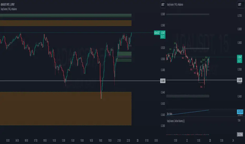
Vasyl Ivanov | FVG, imbalanceFair Value Gap (FVG) / Imbalance Indicator
This indicator is specifically designed to help traders detect Fair Value Gaps (FVG) and Imbalance in the market, highlighting key areas where price action may return to "fill the gap" or restore balance. Additionally, it detects strong FVG scenarios, where Break of Structure (BoS) intersects with an FVG, giving traders an extra level of insight.
Key Features:
Fair Value Gap (FVG) Detection:
The indicator identifies FVGs, which occur when the price leaves an unfilled gap between two bars. These gaps often act as key price targets for future market action, providing potential entry or exit points.
Imbalance Detection:
Imbalances occur when there is a discrepancy between buying and selling pressure, leaving price gaps that the market often seeks to fill. This feature highlights these imbalances on the chart.
Strong FVG Highlighting:
A Strong FVG is marked when there’s an intersection between a Break of Structure (BoS) and an FVG. This situation is highlighted with a distinct color, drawing attention to areas of higher importance where both a BoS and FVG are present, signaling potential significant price moves.
How It Works:
The FVG / Imbalance Indicator scans price action for gaps where price moves too quickly, leaving areas of imbalance:
Fair Value Gaps (FVG) are detected when price leaves a gap, signaling potential levels where the price may retrace.
Imbalance is identified when buying and selling pressure is uneven, leading to unfilled gaps in price action.
Strong FVG detection combines FVG with BoS, highlighting critical zones where price is likely to react significantly due to a structural shift and a gap in price action.
Use Cases:
Gap Trading: Use the FVG indicator to identify potential levels where the market may return to fill the gap, offering valuable entry and exit points.
Detecting Imbalance: Spot areas of price imbalance, which can act as magnets for price retracements.
Key Reversal Zones: Strong FVGs highlight potential reversal or continuation points where both a BoS and FVG intersect, making these zones crucial for high-probability trading opportunities.
Why It’s Unique:
This indicator goes beyond basic FVG and imbalance detection by introducing Strong FVGs, offering traders an advanced tool to identify crucial market zones where structural changes and gaps intersect. The distinct color for Strong FVGs ensures traders don’t miss these high-impact areas.
AutoPilot | FractalystWhat’s the purpose of this indicator?
The AutoPilot indicator automates the management of your active trades by:
Breaks Even: Moves the stop-loss to the entry price once the trade reaches a 1:1 risk-reward ratio.
Closes Trades: Automatically exits trades when trailing stop-losses are triggered.
This automation is facilitated through PineConnector and TradingView webhook integration, allowing traders to manage multiple positions across various markets effortlessly without any manual intervention.
----
How does this indicator trail stop-loss using market structure?
The AutoPilot indicator utilizes an advanced market structure trailing stop-loss mechanism to manage trades based on market dynamics and probabilities.
Here's how it works:
Market Structure Identification: The indicator first identifies key market structures such as higher highs, lower lows.
These structures are pivotal points where the market has shown a change in direction or momentum.
Probability-Based Trailing: Once a trade is active, the stop-loss isn't just set at a fixed distance or percentage but is dynamically adjusted based on the probability of the market structure holding or breaking.
This involves:
Trend Continuation Probability: If the market structure suggests a strong trend continuation (e.g., a series of higher highs in an uptrend), the stop-loss might trail closer to the price, but with a buffer calculated by the probability of the trend continuing versus reversing.
Reversal Probability: Conversely, if there's a high probability of a trend reversal based on recent market structures (like a significant lower high in an uptrend), the stop-loss might be adjusted to a point where the market structure would need to break to confirm the reversal, thus protecting potential profits or minimizing losses.
Dynamic Adjustment: The trailing stop-loss adjusts in real-time as new market structures form. For instance, if a new higher high is formed in an uptrend, the stop-loss might move up but not necessarily to the exact previous swing low. Instead, it's placed at a level where the probability of the next swing low not breaking this level is high, based on historical price action.
Risk Management: By using market structure and probabilities, the indicator aims to balance between giving the trade room to breathe (allowing for normal market fluctuations) and tightening the stop-loss when the market behavior suggests a potential trend change or continuation with high confidence.
This approach ensures that the stop-loss isn't just a static or simple trailing mechanism but a sophisticated tool that adapts to the evolving market conditions, aiming to maximize profit while minimizing the risk of being stopped out prematurely due to market noise.
----
How are the probabilities calculated? What are the underlying calculations?
The probability is designed to enhance trade management by using buyside liquidity and probability analysis to filter out low/high probability conditions.
This helps in identifying optimal trailing points where the likelihood of a price continuation is higher.
Calculations:
1. Understanding Swing highs and Swing Lows
Swing High: A Swing High is formed when there is a high with 2 lower highs to the left and right.
Swing Low: A Swing Low is formed when there is a low with 2 higher lows to the left and right.
2. Understanding the purpose and the underlying calculations behind Buyside, Sellside and Equilibrium levels.
3. Understanding probability calculations
1. Upon the formation of a new range, the script waits for the price to reach and tap into equilibrium or the 50% level. Status: "⏸" - Inactive
2. Once equilibrium is tapped into, the equilibrium status becomes activated and it waits for either liquidity side to be hit. Status: "▶" - Active
3. If the buyside liquidity is hit, the script adds to the count of successful buyside liquidity occurrences. Similarly, if the sellside is tapped, it records successful sellside liquidity occurrences.
5. Finally, the number of successful occurrences for each side is divided by the overall count individually to calculate the range probabilities.
Note: The calculations are performed independently for each directional range. A range is considered bearish if the previous breakout was through a sellside liquidity. Conversely, a range is considered bullish if the most recent breakout was through a buyside liquidity.
----
What does the automation table display?
The automation table in the AutoPilot indicator provides a summary of user-defined settings crucial for automated trade management through PineConnector and TradingView integration. It displays:
PineConnector License ID: This ensures that the indicator is linked to your specific PineConnector account, allowing for personalized and secure automation of your trades.
Order Type (Buy/Sell): Indicates whether the automation is set for buying or selling, which is essential for correctly executing your trading strategy.
Chosen Symbol: Specifies the trading pair or symbol in your broker's platform where the trade management commands (like closing orders) will be executed. This ensures that the automation targets the correct market or asset.
Risk Per Trade: Shows the percentage or amount of your capital you're willing to risk on each trade, helping you maintain consistent risk management across different trades.
Comment: A field for you to input notes or identifiers, particularly useful when trading across multiple markets or instruments. This helps in tracking and managing trades across different assets or strategies.
Comment: A field for you to input identifiers, particularly useful when trading across multiple timeframes or different enries.
Allowing users to manage specific comments for each previously taken entry, facilitating precise management of multiple trades with unique identifiers.
This table serves as a quick reference for your current settings, ensuring you're always aware of how your trades are being managed automatically before any adjustments are made or alerts are triggered.
----
How to use the indicator?
To use the AutoPilot indicator:
Purchase a License ID: Acquire a license ID from PineConnector.
Setup PineConnector EA: Install and configure the PineConnector Expert Advisor on your MetaTrader platform.
Input Settings: Enter your PineConnector license ID, choose the order type, set your risk per trade, add the order comment, and select the trading symbol in the indicator's settings.
Create Alert: Right-click on the automation table, and set up an alert with the provided webhook to connect with PineConnector.
Automatic Management: Once set, your active trades will be automatically managed according to the alert conditions you've set.
This setup ensures your trades are managed seamlessly without constant manual intervention.
----
What makes this indicator original?
Integration with PineConnector: The AutoPilot indicator's originality lies in its integration with PineConnector, which allows for real-time trade management directly from TradingView to your MetaTrader platform. This setup is unique as it combines the analytical capabilities of TradingView with the execution capabilities of MetaTrader through a custom indicator, providing a seamless bridge between analysis and action.
Market Structure-Based Trailing Stop-Loss: Unlike many indicators that might use fixed percentages or ATR (Average True Range) for stop-loss adjustments, the AutoPilot indicator uses market structure (higher highs, lower lows) to dynamically adjust the stop-loss.
Probability-Based Adjustments: The indicator doesn't just trail stop-losses based on price but incorporates the probability of market structure holding or breaking. This probability-based trailing mechanism is innovative, aiming to balance between giving trades room to breathe and tightening when market behavior suggests a potential reversal or continuation.
Customizable Automation Table: The automation table within the indicator allows for detailed customization, including setting specific comments for trades. This feature, while perhaps not unique in concept, is original in its implementation within trading indicators, providing users with a high degree of control and personalization over trade management.
Real-Time Trade Management Alerts: The ability to set up alerts directly from the indicator to manage trades in real-time via webhooks to PineConnector adds a layer of automation that's not commonly found in standard trading indicators. This real-time connection for trade management enhances its originality by reducing the lag between analysis and trade execution.
User-Centric Design: The design of the AutoPilot indicator focuses heavily on user interaction, allowing for inputs like risk per trade, specific order types, and comments. This user-centric approach, where the indicator adapts to the trader's strategy rather than the trader adapting to the tool, sets it apart.
External Integration for Enhanced Functionality: By leveraging external services like PineConnector for execution, the indicator extends its functionality beyond what's typically possible within TradingView alone, making it original in its ecosystem integration for trading purposes.
Practical Implication: This means if you're in a trade and the market structure suggests the trend is continuing (e.g., making higher highs in an uptrend), your stop-loss might trail closer to the price but not too close to avoid being stopped out by normal fluctuations. If the structure breaks (e.g., a lower high in an uptrend), the stop-loss could adjust more aggressively to protect profits or minimize losses, anticipating a potential trend change.
This combination of features creates an original tool that not only analyzes market conditions but actively manages trades based on sophisticated market structure analysis.
----
User-input settings and customizations
----
Terms and Conditions | Disclaimer
Our charting tools are provided for informational and educational purposes only and should not be construed as financial, investment, or trading advice. They are not intended to forecast market movements or offer specific recommendations. Users should understand that past performance does not guarantee future results and should not base financial decisions solely on historical data. By utilizing our charting tools, the buyer acknowledges that neither the seller nor the creator assumes responsibility for decisions made using the information provided. The buyer assumes full responsibility and liability for any actions taken and their consequences, including potential financial losses. Therefore, by purchasing these charting tools, the customer acknowledges that neither the seller nor the creator is liable for any unfavorable outcomes resulting from the development, sale, or use of the products.
The buyer is responsible for canceling their subscription if they no longer wish to continue at the full retail price. Our policy does not include reimbursement, refunds, or chargebacks once the Terms and Conditions are accepted before purchase.
By continuing to use our charting tools, the user acknowledges and accepts the Terms and Conditions outlined in this legal disclaimer.

Visible Range Volume Profile Heatmap [MyTradingCoder]The Visible Range Volume Profile Heatmap indicator offers a visually striking and insightful way to analyze trading volume within the visible price range of your chart. This tool goes beyond traditional volume profiles by displaying volume distribution as a heatmap, where color intensity represents the volume traded at each price level.
Key Features:
Dynamic Heatmap: Displays volume concentration using a color gradient, making it easy to spot areas of high and low trading activity.
Customizable Grid: Choose between auto-scaling or manual grid configuration to suit your analysis needs.
Flexible Color Schemes: Select from tri-tone or two-tone color palettes to represent bullish and bearish volume.
Point of Control (POC) Overlay: Highlights the price level with the highest trading volume, a critical reference point for traders.
Adjustable Transparency: Fine-tune the visibility of the heatmap to balance it with other chart elements.
Lookback Period: Customize the number of bars used for volume profile calculation.
How to Use the Visible Range Volume Profile Heatmap:
The Visible Range Volume Profile Heatmap is a powerful tool that can significantly enhance your market analysis when used effectively. To get the most out of this indicator, start by observing the overall pattern of the heatmap. Areas with darker colors represent higher volume concentration, indicating price levels where significant trading activity has occurred. These areas often serve as important support or resistance levels, as they represent prices where many traders have established positions.
Pay close attention to the Point of Control (POC), represented by a line running through the heatmap. This line marks the price level with the highest trading volume and often acts as a magnet for price action. Price tends to gravitate towards the POC, making it a crucial reference point for potential reversals or continuations.
When analyzing potential trades, consider how the current price relates to the volume distribution shown in the heatmap. If the price is approaching a high-volume area from below, it might face resistance; conversely, if it's approaching from above, that area might provide support. Breakouts beyond significant volume nodes can be particularly noteworthy, as they may signal a shift in market sentiment.
Use the heatmap in conjunction with your existing trading strategies. For example, if you're a trend follower, you might look for breakouts beyond major volume areas as confirmation of trend continuation. If you're a mean reversion trader, you might consider entries when price moves away from high-volume nodes, anticipating a return to these heavily traded levels.
The indicator can also help in identifying potential profit targets. As price moves away from one volume node, it often continues until it reaches the next significant volume area. These areas can serve as logical places to consider taking profits or adjusting your position.
For longer-term analysis, observe how the volume profile changes over time. Shifts in the distribution of volume can indicate evolving market dynamics. A broadening of the high-volume area might suggest increasing uncertainty, while a narrowing could indicate building consensus about price.
Settings Explained:
Auto Grid Configuration:
The "Auto Scale" option automatically adjusts the grid size based on the visible chart area. This ensures optimal visualization regardless of your chart's dimensions or zoom level.
Auto Scale Grid Size: Determines the total number of cells in the heatmap. A higher number provides more granular detail but may increase calculation time.
Auto Scale Grid Ratio: Adjusts the aspect ratio of the grid cells. A higher ratio creates wider, more rectangular cells, while a lower ratio results in more square-shaped cells. Experiment to find the best visual representation for your analysis.
Lookback Period:
The lookback setting determines how many columns (bars) of historical data the indicator uses to calculate the volume profile. A larger lookback will provide a more comprehensive view of historical volume distribution but may be slower to react to recent changes. A smaller lookback will be more responsive to recent volume patterns but may miss longer-term trends.
Manual Grid Configuration:
If you prefer more control over the grid layout, you can switch to manual configuration:
Column Width: Sets the number of price bars each column of the heatmap represents. A wider column aggregates more data, smoothing out the profile.
Number of Rows: Determines the vertical resolution of the heatmap. More rows provide finer price level detail but may make the overall pattern less distinct.
Tips for Optimization:
For short-term trading, use a smaller lookback and finer grid settings to capture recent market dynamics.
For longer-term analysis, increase the lookback and use wider columns to identify persistent volume patterns.
If the heatmap appears too blocky, increase the number of rows or decrease the column width.
If the heatmap is too granular, making patterns hard to discern, do the opposite.
Remember, the ideal settings often depend on your specific trading timeframe, the asset you're analyzing, and your personal analytical preferences. Don't hesitate to experiment with different configurations to find what works best for your trading style.
Conclusion
The Visible Range Volume Profile Heatmap is more than just an indicator—it's a versatile tool that enhances your ability to analyze and interpret market data. By transforming volume profiles into an intuitive, color-coded heatmap, this indicator allows you to quickly identify critical price levels where significant trading activity has occurred. Whether you're a day trader focused on short-term moves or a swing trader analyzing longer-term trends, the customizable settings of this tool provide the flexibility needed to adapt to various market conditions.
The ability to configure the grid layout, adjust the lookback period, and fine-tune the color and transparency settings ensures that the heatmap can be tailored to your specific trading strategy. By highlighting key areas of support and resistance, identifying potential breakouts, and pinpointing the Point of Control (POC), the heatmap gives you actionable insights that can enhance your decision-making process.
Incorporate the Visible Range Volume Profile Heatmap into your trading routine to gain a deeper understanding of market dynamics and to spot opportunities that might otherwise go unnoticed. Remember to experiment with the settings to find the configuration that best suits your analysis style, and use this powerful indicator in conjunction with your existing strategies for optimal results. With the right approach, this tool can become an indispensable part of your trading toolkit, helping you navigate the markets with greater confidence and precision.

DTFX Algo Zones [LuxAlgo]DTFX Algo Zones are auto-generated Fibonacci Retracements based on market structure shifts.
These retracement levels are intended to be used as support and resistance levels to look for price to bounce off of to confirm direction.
🔶 USAGE
Due to the retracement levels only being generated from identified market structure shifts, the retracements are confined to only draw from areas considered more important due to the technical Break of Structure (BOS) or Change of Character (CHoCH).
The simple action that causes a market structure shift occurs is price breaking above or below a specific swing point. When a market structure shift happens, a retracement is drawn from the point of break to the highest or lowest point since that point. Due to the price action necessary for a market structure shift, these retracements will not always be immediately actionable.
These retracement levels are intended to be used as points to watch for price to retrace to and bounce from, confirming the current direction of price.
In the example below, after the retracement is initiated, by bouncing off of the retracement levels formed from the previous market structure shift it would further confirm the bias of the market structure shift. A break going through these levels would display a weakness from the current market structure shift, implying that it could simply be noise.
🔶 DETAILS
The script uses standard SMC Market structure identification to determine Break of Structures (BOS) and Change of Characters (CHoCH). The specific swing points can be identified by the shapes placed above or below the specific swing high/low candle.
By unchecking the "Display All Zones" setting, users are able to specify the exact number of retracement zones to display using the "Show Last" parameter. This is handy for cleaning up the chart to stay focused on the most recent retracements.
Additionally, when displaying multiple zones, the "Clean-Up Level Overlap" setting may be helpful for decluttering as well. This option optimizes the display of retracement levels to minimize their overlap on other adjacent zones.
The script allows for up to 5 Fib levels to be displayed from each zone, with options for display, value, line style, and color for each of the 5.
The calculation for Fib Levels changes depending on the direction of market structure shifts. When an upwards (Bullish) zone is generated, the retracement is drawn with the bottom of the zone being 0 and the top of the zone being 1. This is reversed for downwards (Bearish) zones.
🔶 SETTINGS
Structure Length: Sets the SMC structure length to use for finding MMS.
Show Last: Displays this number of retracement zones. (Display All Zones Must be Unchecked)
Display All Zones: Ignores "Show Last" number and displays all historical MMS Retracement Zones.
Zone Display: Choose which zones to display, only bearish, only bullish, or both.
Clean-Up Level Overlap: Minimizes overlap between adjacent zones and levels.
Fib Levels: Settings to display and customize up to 5 Fib levels for each zone.

Curved Smart Money Concepts Probability (Zeiierman)█ Overview
The Curved Smart Money Concepts Probability indicator, developed by Zeiierman, is a sophisticated trading tool designed to leverage the principles of Smart Money trading. This indicator identifies key market structure points and adapts to changing market conditions, providing traders with actionable insights into market trends and potential reversals. The trading tool stands out due to its unique curved structure and advanced probability features, which enhance its effectiveness and usability for traders.
█ How It Works
The indicator operates by analyzing market data to identify pivotal moments where institutional investors might be influencing price movements. It employs a combination of adaptive trend lengths, multipliers for sensitivity adjustments, and pivot periods to accurately capture market structure shifts. The indicator calculates upper and lower bands based on adaptive sizes and identifies zones of overbought (premium) and oversold (discount) conditions.
Key Features of Probability Calculations
The Curved Smart Money Concepts Probability indicator integrates sophisticated probability calculations to enhance trading decision-making:
Win/Loss Tracking: The indicator tracks the number of successful (win) and unsuccessful (loss) trades based on the identified market structure points (ChoCH, SMS, BMS). This provides a historical context of the indicator's performance.
Probability Percentages: For each market structure point (ChoCH, SMS, BMS), the indicator calculates the probability of the next move being successful or not. This is presented as a percentage, giving traders a quantifiable measure of confidence in the signals.
Dynamic Adaptation: The probability calculations adapt to market conditions by considering the frequency and success rate of the signals, allowing traders to adjust their strategies based on the indicator’s historical accuracy.
Visual Representation: Probabilities are displayed on the chart, helping traders quickly assess the likelihood of future price movements based on past performance.
Key benefits of the Curved Structure
The Curved Smart Money Concepts Probability indicator features a unique curved structure that offers several advantages over traditional linear structures:
Noise Reduction: The curved structure smooths out short-term market fluctuations, reducing the noise often seen in linear structures. This helps traders focus on the true trend direction rather than getting distracted by minor price movements.
Adaptive Sensitivity: The curved structure adjusts its sensitivity based on market conditions. This means it can effectively capture both short-term and long-term trends by dynamically adapting to changes in market volatility, something linear structures struggle with.
Enhanced Trend Detection: By providing a more gradual transition between market phases, the curved structure helps in identifying trends more accurately. This is particularly useful in volatile markets where linear structures might give false signals due to their rigid nature.
Improved Market Structure Analysis: The curved structure's ability to adapt and smooth out irregularities provides a clearer picture of the overall market structure. This clarity is essential for identifying premium and discount zones, as well as mid-range support and resistance levels, which are crucial for effective ICT Smart Money Trading.
█ Terminology
ChoCH (Change of Character): Indicates a potential reversal in market direction. It is identified when the price breaks a significant high or low, suggesting a shift from a bullish to bearish trend or vice versa.
SMS (Smart Money Shift): Represents the transition phase in market structure where smart money begins accumulating or distributing assets. It typically follows a BMS and indicates the start of a new trend.
BMS (Bullish/Bearish Market Structure): Confirms the trend direction. Bullish Market Structure (BMS) confirms an uptrend, while Bearish Market Structure (BMS) confirms a downtrend. It is characterized by a series of higher highs and higher lows (bullish) or lower highs and lower lows (bearish).
Premium: A zone where the price is considered overbought. It is calculated as the upper range of the current market structure and indicates a potential area for selling or shorting.
Mid Range: The midpoint between the high and low of the market structure. It often acts as a support or resistance level, helping traders identify potential reversal or continuation points.
Discount: A zone where the price is considered oversold. It is calculated as the lower range of the current market structure and indicates a potential area for buying or going long.
█ How to Use
Identifying Trends and Reversals: Traders can use the indicator to identify the overall market trend and potential reversal points. By observing the ChoCH, SMS, and BMS signals, traders can gauge whether the market is transitioning into a new trend or continuing the current trend.
Example Strategies
⚪ Trend Following Strategy:
Identify the current market trend using BMS signals.
Enter a trade in the direction of the trend when the price retraces to the mid-range zone.
Set a stop-loss just below the mid-range (for long trades) or above the mid-range (for short trades).
Take profit in the premium/discount zone or when a ChoCH signal indicates a potential reversal.
⚪ Reversal Strategy:
Wait for a ChoCH signal to identify a potential market reversal.
Enter a trade in the direction of the new trend as indicated by the SMS signal.
Set a stop-loss just beyond the recent high (for short trades) or low (for long trades).
Take profit when the price reaches the premium or discount zone opposite to the entry.
█ Settings
Curved Trend Length: Determines the length of the trend used to calculate the adaptive size of the structure. Adjusting this length allows traders to capture either longer-term trends (for smoother curves) or short-term trends (for more reactive curves).
Curved Multiplier: Scales the adjustment factors for the upper and lower bands. Increasing the multiplier widens the bands, reducing sensitivity to price changes. Decreasing it narrows the bands, making the structure more responsive.
Pivot Period: Sets the period for capturing trends. A higher period captures broader trends, while a lower period focuses on short-term trends.
Response Period: Adjusts the structure’s responsiveness. A low value focuses on short-term changes, while a high value smoothens the structure.
Premium/Discount Range: Allows toggling between displaying the active range or previous range to analyze real-time or historical levels.
Structure Candles: Enables the display of curved structure candles on the chart, providing a modified view of price action.
-----------------
Disclaimer
The information contained in my Scripts/Indicators/Ideas/Algos/Systems does not constitute financial advice or a solicitation to buy or sell any securities of any type. I will not accept liability for any loss or damage, including without limitation any loss of profit, which may arise directly or indirectly from the use of or reliance on such information.
All investments involve risk, and the past performance of a security, industry, sector, market, financial product, trading strategy, backtest, or individual's trading does not guarantee future results or returns. Investors are fully responsible for any investment decisions they make. Such decisions should be based solely on an evaluation of their financial circumstances, investment objectives, risk tolerance, and liquidity needs.
My Scripts/Indicators/Ideas/Algos/Systems are only for educational purposes!
Uptrick: 6 Coins Market Data TableThe "Uptrick: 6 Coins Market Data Table" indicator is a sophisticated tool designed to provide a comprehensive snapshot of the market data for six major cryptocurrencies. This tool displays crucial information in a table format directly on the chart, enabling traders to make informed decisions quickly. It focuses on providing key metrics such as the Relative Volatility Index (RVI), volume, buy and sell pressure, and liquidity for each coin. The primary purpose of this indicator is to consolidate essential market data for multiple cryptocurrencies into a single, easy-to-read table. This facilitates quick analysis and comparison, helping traders assess market volatility and momentum using the Relative Volatility Index (RVI), monitor trading volume to understand market activity and interest, evaluate buy and sell pressure to gauge market sentiment, and determine liquidity to understand the ease of entering or exiting positions. The indicator is titled "Uptrick: 6 Coins Market Data Table" and is set to overlay on the chart, ensuring that it does not obstruct the view of price action. It uses a custom function to calculate buy and sell pressure based on price movements and trading volume, where buy pressure measures the volume of trades executed at prices above the low but below the high, indicating buying interest, and sell pressure measures the volume of trades executed at prices below the high but above the low, indicating selling interest. Liquidity is calculated as the product of the trading range (high - low) and the trading volume, helping in understanding the ease with which an asset can be traded without affecting its price. The RVI is calculated using the standard deviation of price changes and the exponential moving average (EMA), distinguishing between periods of increasing and decreasing volatility to provide a normalized measure of market volatility, with the RVI value ranging from 0 to 100, where higher values indicate higher volatility. The table is created with six rows and seven columns, with each row representing a cryptocurrency and each column representing a specific metric. The first row of the table includes headers for each metric: Symbol, RVI, Volume, Buy Pressure, Sell Pressure, and Liquidity. The populateTable function retrieves and calculates the necessary data for each cryptocurrency, fetching open, high, low, close prices, and volume, then calculating the RVI, buy/sell pressure, and liquidity. These values are populated into the respective cells in the table, ensuring that traders can see all relevant data at a glance. The indicator allows users to specify six different cryptocurrency symbols through input fields, enabling traders to monitor their preferred coins. The table columns include Symbol (the trading symbol of the cryptocurrency, e.g., BTCUSDT), RVI (the Relative Volatility Index displayed as a percentage, indicating the volatility level), Volume (the trading volume for the specified period, indicating the level of trading activity), Buy Pressure (a volume-based measure of buying interest), Sell Pressure (a volume-based measure of selling interest), and Liquidity (a measure of the asset’s liquidity, combining price range and volume). By bringing together multiple key metrics for six cryptocurrencies into one table, the indicator provides a centralized view of market conditions, enhancing decision-making as traders can quickly assess volatility, market sentiment, and liquidity, aiding in more informed trading decisions. The tool's customizability, allowing users to tailor the table to display their preferred cryptocurrencies, makes it versatile for different trading strategies. This detailed description outlines the functionality and purpose of the "Uptrick: 6 Coins Market Data Table" indicator, emphasizing its role in providing comprehensive and actionable market data for traders.
Price Reversal Probability + Price Forecast [TradeDots]The TradeDots Price Reversal Probability + Price Forecast Indicator helps traders discern market direction and identify potential trading opportunities.
📝 HOW IT WORKS
The indicator provides two types of reversal signals:
Bullish Reversal: Marked with a green label, indicating an expected upward market reversal.
Bearish Reversal: Marked with a red label, indicating an expected downward market reversal.
⭐️ Computation
This tool identifies significant reversal patterns using a mathematical model on a designated window of candlesticks to calculate price action changes. It incorporates candlestick data and price indicators, such as the Open, Close, High, Low of candlesticks and Average True Range (ATR), to detect similar occurrences in real-time.
Potential market turning points are marked with reversal labels and percentage changes , calculated using pivot high or low price data from the last reversal patterns of the opposite side.
For example, a green label on the chart indicates a bullish reversal pattern, showing the market is expected to reverse upward. However, signals are based on historical price actions and are not 100% accurate. If the price breaks down from the bullish reversal pivot low, the original signal will turn half transparent until the next reversal pattern is detected.
The algorithm groups consecutive bullish reversal patterns until a bearish reversal pattern appears. The last bullish label occurrence indicates the maximum number of bullish patterns required to confirm a reversal in the group. This information is stored to apply Bayesian statistical models and probability models to generate market insights.
⭐️ Statistical Analysis
Reversal signals are categorized into bullish and bearish groups, with each group storing consecutive reversal signals.
In the indicator table, each new reversal is labeled sequentially (e.g., "🟢 #1" for the first bullish reversal after a bearish signal). The number increases for each new signal on the same side and resets when a reversal signal on the opposite side appears.
The indicator provides two forecasts: the probability of reversal and the expected price change if the pattern is successful or unsuccessful.
⭐️ Probability of Reversal
By counting the number of consecutive reversal patterns on one side before a reversal pattern on the opposite side appears, we can calculate the probability of reversal of each signal throughout the entire price action history.
Using Bayes’ Theorem, the probability increases with each consecutive pattern. The values are displayed in the first two columns of the indicator table, with the current condition highlighted in orange.
⭐️ Price Forecast
The price forecast uses the pivot point of the last reversal pattern of the opposite side as a reference for calculating the percentage change.
For example, for a group of bullish patterns, the pivot high of the most recent bearish pattern is taken. A percentage is calculated with the pivot low of all bullish patterns in the same group. Repeating this model throughout the entire historical price action patterns gives the average price percentage difference between all bearish and bullish patterns.
Whenever a new reversal pattern is detected, a price can be forecasted using the percentage difference from the statistical model. The target price is calculated and displayed in the third and fourth columns of the indicator table.
Assisting Traders To Make Data-Informed Trading Decisions
All included features in this indicator:
Labeling of bullish and bearish reversal patterns
Success probability of each reversal pattern
Price targets of each reversal pattern
Visual aid for pattern confirmation
More (check the changelog below for current features)
🛠️ HOW TO USE
⭐️ Reversal Signals
There are two types of reversal signals identified by the algorithm that detects reversal patterns using price action analysis with candlestick data and price indicators. When the price breaks out from the labeled pivot, the label will turn half transparent.
Bullish reversal signals: Labeled in green. The number represents the price of the candlestick "low," and the percentage value indicates the price difference from the previous bearish reversal pattern's candlestick "high."
Bearish reversal signals: Labeled in red. The number represents the price of the candlestick "high," and the percentage value indicates the price difference from the previous bullish reversal pattern's candlestick "low."
⭐️ Probability Table
The probability table shows the likelihood of reversal for each number of occurrences of bullish and bearish reversal signals, displayed in the first two columns.
It also shows the target prices for both bullish and bearish conditions for each number of reversal patterns.
⭐️ Price Targets
By combining the probability of reversal and the price forecast, price targets for new reversal patterns are calculated. These insights help traders align their strategies with price action analysis and statistics by simply observing the candlestick chart in real-time.
Bullish Price Target: The average percentage price and probability that the next bearish reversal signal might hit.
Bearish Price Target: The average percentage price and probability that the next bullish reversal signal might hit.
⭐️ Market Trend Panel
The market trend panel is a small table that indicates the market trend using a 200 Exponential Moving Average (EMA) alongside reversal signals. A bullish reversal pattern above the moving average indicates a "bullish" market, while a bearish reversal pattern below it indicates a "bearish" market. If the price fluctuates around the moving average, it is identified as "choppy."
The panel also shows the risk and reward for each trade by taking the closing bullish and bearish targets from the most recent reversal pattern's price reference. Lastly, it displays the probability of reversal, consistent with the number highlighted in the probability table.
⭐️ Other Visual Aid
Other visual aids visualize the market trend and potential direction for users on the candlestick chart.
Background colors reflect the current market trend (green = bullish, red = bearish, blue = choppy).
A white plotted line represents the moving average for categorizing market trends.
❗️LIMITATIONS
Price targets represent only the mean of percentage differences. Therefore, the price could reverse before hitting either side of the price target.
When the market is in extreme price action or a new market pattern, the price targets may not be forecasted accurately and might move out of the model's range.
This model works best for assets with less price variation and a near-Gaussian distribution in returns. It may be less accurate for assets with random price movements.
CONCLUSION
This indicator uses fundamental statistics and mathematical models to generate reversal probabilities and price forecasts. It does not have the ability to predict the future with certainty. Traders should combine this indicator with other confirmation strategies to make informed investment decisions.
See Author's instructions below to get instant access to this indicator.
RISK DISCLAIMER
Trading entails substantial risk, and most day traders incur losses. All content, tools, scripts, articles, and education provided by TradeDots serve purely informational and educational purposes. Past performances are not definitive predictors of future results.
NOTES*
Calculations are based on historical data and do not guarantee future results.
Reversals exceeding ten consecutive occurrences are rare (likely <1% of total occurrences).
Users SHOULD NOT blindly follow the price targets as their trading strategy.
If you encounter a timeout with this indicator, reapply it to your chart.
Weighted Moving Range with Trend Signals (WMR-TS)Weighted Moving Range with Trend Signals (WMR-TS)
Technical analysis involves analyzing statistical trends from trading activity , such as price movement and volume, to make trading decisions. Technical indicators are mathematical calculations based on the price, volume, or open interest of a security or contract. They are used by traders to analyze price movements and predict future market behavior. The WMR-TS indicator combines weighted moving averages and range calculations to identify key trading levels and generate buy/sell signals. It dynamically adjusts to market conditions, offering traders insights into potential support, resistance, and trend reversal points. Key levels are color-coded for quick interpretation. It utilizes weighted moving averages (WMA) and range calculations to determine these levels, making it a robust tool for both trending and ranging markets.
SUMMARY
Parameters :
WMA Length : Determines the length for the primary weighted moving average.
Highest High Length : Sets the period for calculating the highest high.
Lowest Low Length : Sets the period for calculating the lowest low.
Range Corrector : Adjusts the range calculation slightly for fine-tuning.
Top Level : Multiplier for determining the top level from the calculated range.
Bottom Level : Multiplier for determining the bottom level from the calculated range.
Levels Visibility : Sets how many recent bars will display the levels.
Trading Zones :
Short Area : Highlighted zone indicating potential shorting opportunities.
Long Area : Highlighted zone indicating potential buying opportunities.
The Levels :
Wave (Yellow): Midpoint of the calculated range, adjusted by WMA.
Top Level (Red): Calculated upper boundary of the trading range.
Sell Level (Pink): Intermediate sell level.
Resistance Level (Magenta): Immediate resistance level.
Support Level (Cyan): Immediate support level.
Buy Level (Light Green): Intermediate buy level.
Bottom Level (Dark Green): Calculated lower boundary of the trading range.
Interpreting the Signals :
Hammer Signal : Red circles above bars indicate potential sell signals.
Rocket Signal : Green circles below bars indicate potential buy signals.
KEY CONCEPTS
Highest High and Lowest Low :
These values represent the highest high ( HH ) and lowest low ( LL ) over a specified number of periods.
Support Level :
This is the lower boundary of the trading range. It is a price level where demand is strong enough to prevent the price from falling further. As the price approaches the support level, it is likely to bounce back up.
Resistance Level :
This is the upper boundary of the trading range. It is a price level where supply is strong enough to prevent the price from rising further. As the price approaches the resistance level, it is likely to pull back down.
THE USE OF MULTIPLIERS :
The script uses several multipliers to adjust and fine-tune the calculated support and resistance levels, as well as to control the range and sensitivity of these levels. Here is a detailed explanation of these multipliers and their purpose:
Range Corrector : This multiplier adjusts the calculated high ( H ) and low ( L ) levels, adding flexibility to how these levels are positioned relative to the highest high and lowest low. It ranges from -1 to 1 , with a default value of 0 . The use of positive values increase the range, making the calculated levels further apart. Thus, using negative values decrease the range, bringing the calculated levels closer together.
Top Level : This multiplier adjusts the distance of the top level from the calculated high H ) level. It fluctuates from 0 to 2 , with a default value of 0.382 . Higher values will push the top level further above the high level, while lower values will bring it closer.
Bottom Level : This multiplier adjusts the distance of the bottom support level from the calculated low support level. Ranging from 0 to 2, with a default value of 0.214, the higher values will push the bottom level further below the low level, while lower values will bring it closer.
The script plots the support and resistance levels on the chart, allowing traders to visualize the trading range. Color-coded zones are used to indicate areas where buying or selling opportunities may arise based on the current price relative to the trading range. A trading range refers to the area between a price's support and resistance levels over a specific period of time. Within this range, the price of the security fluctuates up and down but does not break out above the resistance or below the support. Support and resistance levels to make trading decisions. Buying near the support level and selling near the resistance level is a common strategy. When the price moves above the resistance level, it is called a breakout . A breakout often indicates that the price may start a new upward trend . Conversely, when the price moves below the support level, it is called a breakdown . A breakdown often indicates that the price may start a new downward trend . By understanding and utilizing trading ranges, traders can make more informed decisions, optimize their trading strategies, and manage risk more effectively.
Understanding Moving Averages
A moving average (MA) is a widely used technical indicator that helps smooth out price data by creating a constantly updated average price. The main purpose of using a moving average is to identify the direction of the trend and to reduce the "noise" of random price fluctuations. The Weighted Moving Average ( WMA ) assigns different weights to each period, with more recent periods typically given more weight. A 10-day WMA might give the most recent day a weight of 10, the second most recent day a weight of 9, and so on. It is useful for traders who want to emphasize recent price data more than older data. When the price is above the moving average, it suggests an Bullish trend . A Bearish Trend is expected to take place when the price is below the moving average. Understanding the price reactions around these levels can be used to make trading decisions.
APPLYING CONCEPTS
Support and Resistance Calculations in the Script :
The script calculates dynamic support and resistance levels using weighted moving averages ( WMA s) and the highest high and lowest low over specified periods. Buy ( Rocket ) and sell ( Hammer ) signals are generated based on the crossing of the price with calculated top and bottom levels.These signals help traders identify potential entry and exit points within the trading range .
Weighted Moving Average (WMA) Application in the Script
This script calculates a special trendWMA using the close price that helps in creating a more dynamic moving average that considers both high and low price actions. This modified WMA is used in conjunction with highest high and lowest low values over specified periods to calculate dynamic support and resistance levels.
Explanation of the Levels in the Script
By understanding these levels, traders can make more informed decisions about where to enter and exit trades, manage risk, and anticipate potential market movements. The script incorporates several key levels levels that traders can use to better anticipate price movements and make more informed trading decisions. Leveraging the principles of Fibonacci retracement ratios ( 23.6%, 38.2%, 50%, 61.8%, and 100% ) to identify key support and resistance zones can also serve for gauging the overall market sentiment.
Top Level and Sell Leve l: Used to identify potential resistance zones where the price may reverse or pause.
Support Level and Buy Level : Used to identify potential support zones where the price may bounce.
Upper and Lower Pivot Values : Serve as intermediate levels for possible price retracements or extensions within the trading range.
Wave Level : Indicates the central trend direction, which can be useful for gauging the overall market sentiment.
Alerts are a crucial part of the script as they notify traders of potential buy and sell signals based on predefined conditions. There are two main alerts: one for a " Hammer " signal (sell condition) and one for a " Rocket " signal (buy condition).
Adjust the input parameters to fit your trading style and the specific asset being analyzed. Shorter lengths may be more responsive to price changes but can produce more false signals , while longer lengths provide smoother signals but may lag . Always backtest the indicator on historical data to understand its behavior and performance. Also remember that different markets may require different parameter settings for optimal performance.
Keep in mind that by nature like all moving averages, WMAs lag behind price action. This means that signals may be delayed. The indicator performs differently in various market conditions. Always consider the overall market context when interpreting signals.
Adjusting parameters like the range corrector and visibility can help tailor the indicator to specific market conditions or trading strategies, improving its effectiveness. The script uses the calculated levels to plot lines and fill zones on the chart, helping traders visualize potential support, resistance, and trend reversal points. The use of multipliers allows for dynamic adjustment of these levels, making the indicator flexible and adaptable to different market conditions.
I think traders can make more informed decisions about where to enter and exit trades, manage risk, and anticipate potential market movements following this code. Stay safe and always remember that market is always changing. Use this tool if you want, please stay informed and plan safe trades,
D.